
Context Explorer
Cutting context discovery time in half with a new visualization tool
Oncologists specialize in researching disease and tissue types called contexts. DepMap’s context resource lacked the ability to browse available data and an indirect pathway for downstream analysis, resulting in a long, frustrating experience.
Role
Lead UX/UI Designer
Collaborators
2 Computational Biologists
1 Full Stack Engineer
Stakeholders
Director of Engineering
CDSLeadership
Duration
8 months for 1.0 (2023)
2 months for 2.0 (2024)
-
In cancer research, contexts are categories that refer to disease and tissue type (such as Ewing Sarcoma and bone). Oncologists were frustrated with DepMap’s context resources, which relied on tables that made discovering data types associated with context difficult and time consuming.
We created Context Explorer, a tool that visualizes available data according to lineage or disease type. It visualizes an overview of data, gene dependencies, and drug sensitivities. Features include interactive scatter and box plots, and enables researchers to quickly open curated plots in our Data Explorer tool, reducing the time it takes to identify contexts of interest by 50%.
What is DepMap, and why are contexts and lineages important to cancer research?
The Cancer Data Science team at the Broad Institute produces terabytes of data, spanning approximately 1300 cell line models that represent the diversity of human cancers. The DepMap portal contains tools that allows an average of 500k scientists to analyze that data and export the results in order to fuel their research.
Oncologists specialize in studying genes and cell lines corresponding to a disease, such as Ewing Sarcoma. We call this a disease context. These genes can be expressed in tissues and organs, which are called lineages. When researching cancer data, oncologists tend to look for genes in their context of interest; they want to know if these genes are also active in other contexts and lineages in order to discover common vulnerabilities.
The Problem: DepMap doesn’t have a dedicated tool for browsing data by disease context.
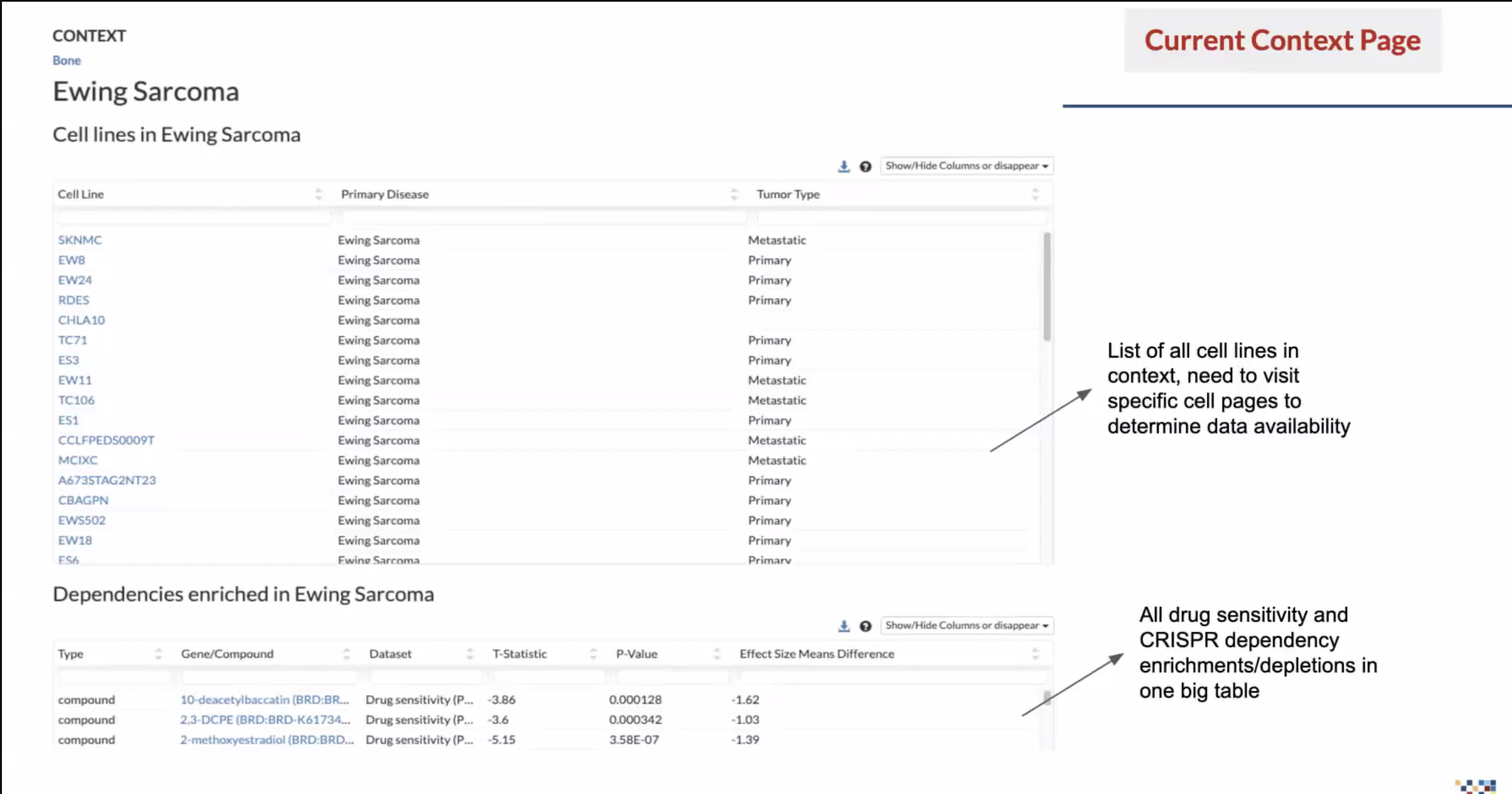
At the time, the way to find data by context was to search for a disease or tissue, sort through two tables, click on cell line names, review the information on the corresponding cell line page, then copy and paste into the Data Explorer tool…that is a lot.
Data is screened according to libraries; there wasn’t a clear way to know what kind of data was available and whether it was a CRISPR or RNAi screen. And if they were looking for drug sensitivity, they had to sort through a massive table that also included dependencies. Our researchers were passionate in telling us what a complete waste of time this was.
Our Goal: Cut discovery time in half by creating a visualization tool that identifies available data according to context
Create an intuitive and browsable interface that helps researchers answer context research questions quickly by displaying pre-computed statistics that show available data types and understand the specificity of dependencies and drug sensitivities. Enable researchers to then easily export these datasets for deeper investigation in other portal tools.
Solution: Context Explorer, a one-stop shop for visualizing context and lineage data
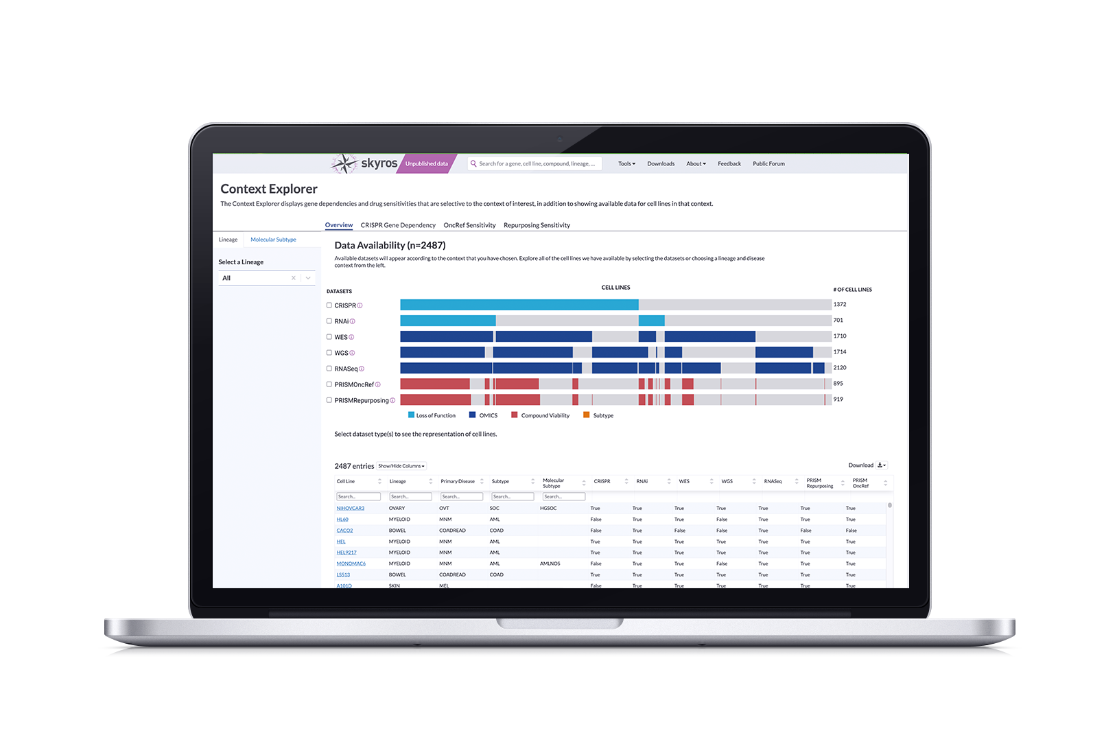
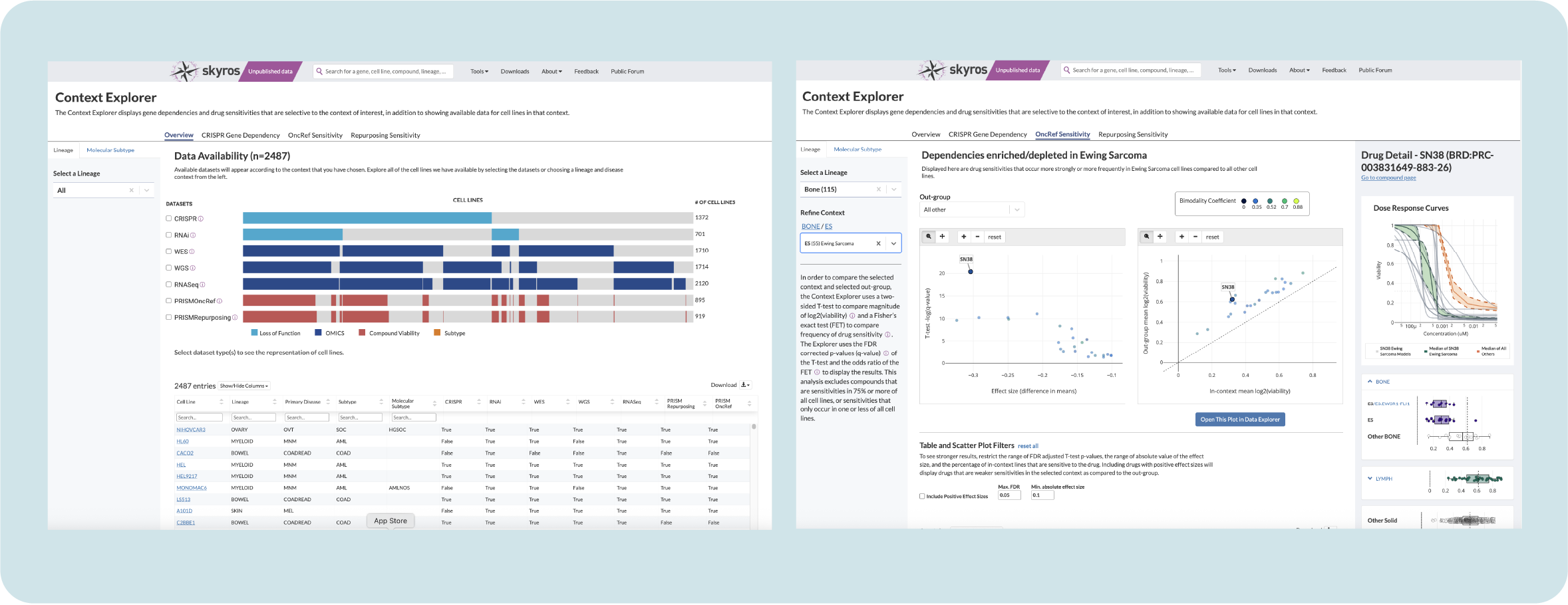
We created Context Explorer, which visualizes available data according to their chosen lineage or disease type. It has four main sections focusing on an overview of data, gene dependencies, and drug sensitivities. Its features allow users to:
See dataset distribution within screen types for the given context and to determine overlapping cell lines
Show more granular information and metadata for each individual cell line
Select individual genes and create a custom context to use in downstream analysis
Export refined data in multiple formats to use
Context Explorer has reduced the time it takes to collect and analyze data by context by 50% and removed friction from performing downstream analysis by allowing users to open curated plots in Data Explorer. This design served as a template for new tools, unifying the platform and easing cognitive load for users.
Process Overview
I was the sole designer for this project, collaborating with two computational biologists specializing in oncology and pediatric cancers, serving as subject matter experts (SMEs), along with a dedicated full-stack engineer, presenting biweekly to our cancer data science leadership stakeholders.
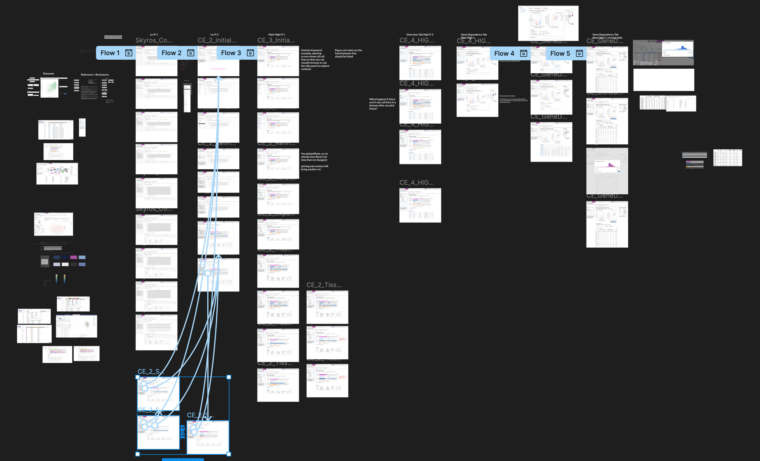
I led the UX process of discovery, requirements definition, visual analysis, ideation with low/med/high fidelity prototypes, user testing, and evaluation. It got messy at times.
Research questions derived from forum requests
We collected questions and requests related to context inquiry through our user forum. The context was important, but what information related to a context was important? Our SMEs contacted 19 scientists to gather insights to find common themes and distill them into 2 main research questions:
Given a disease context:
How many cell lines are there? What data is available for those cell lines?
Are there gene dependencies or drug sensitivites that are selective to my context?
How strong is this selective vulnerability?
Is this unique to my context, or are there other contexts that are selectively dependent on this gene compound?
Translating research questions into an MVP scope
Context Explorer MVP (1.0):
Ability to select a lineage and refine by subtype to populate visualizations
Overview visualization of available datasets and number of cell lines
A visualization for comparing dependencies between context and other groups
Another visualization for comparing drug sensitivities between context and other groups
Corresponding table that filters plot by selecting genes or drugs
A detail panel that compares expression in tissue lineage to other lineages with static plots
Nice to haves (2.0)
Ability to browse by molecular subtype
Detail panel for drug sensitivity with dose curve
Add interactivity to lineage plots
Iterations and Tradeoffs
Selecting a lineage and Disease type
To tackle selecting a disease lineage from a tissue, I mapped out a few flows on how to arrive at a subtype. Selecting your tissue activated a collapsible sub-menu that organized primary disease types according to OncoTree code with stacked subtypes.
To ease cognitive load, I decided to frame this as two steps: Select your lineage and then refine from that lineage. A common pain point is that our tools aren’t very intuitive, so breaking up actions into steps helps better guide our users towards their discoveries.
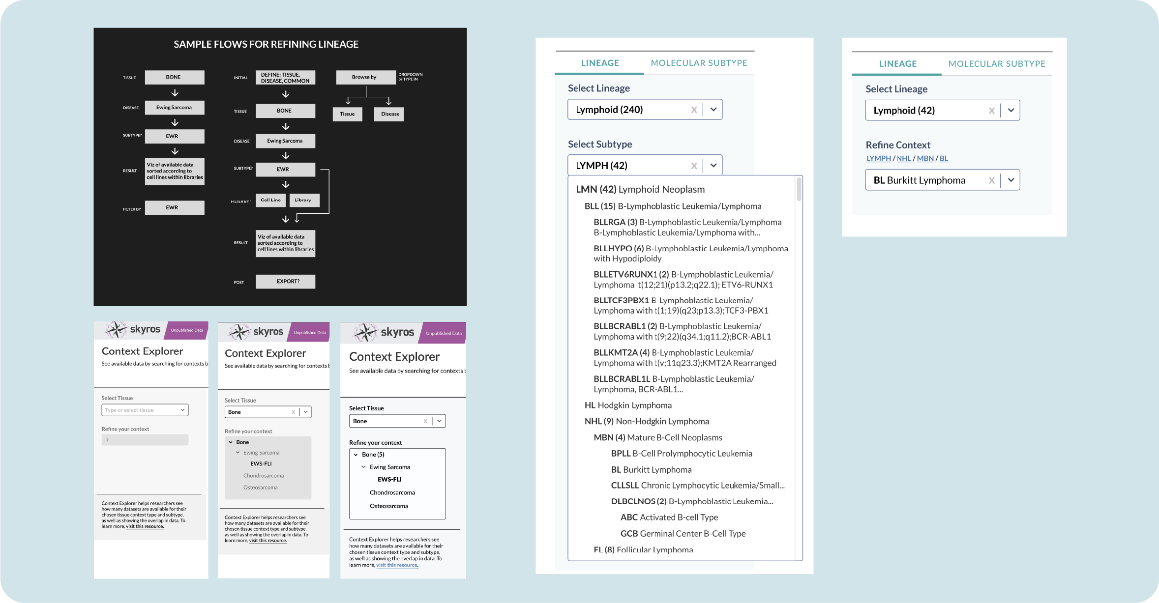
In version 2.0, we added a toggle to select between lineage and molecular subtype. Layers of information were added to our lineage subtype; a single disease subtype could have up 6 layers of specificity. Adding a link breadcrumb allows you to see where your chosen subtype exists and navigate back to its parent category.
Which visualization is best?
The Overview page shows available data according to screens and cell lines, so we explored familiar ways of displaying data. Sunburst visualizations are common and provide an opportunity for motion by clicking a burst to expand subtypes.
However, a use case emerged where scientists were interested in the overlap of data types (does my context contain CRISPR and RNAi screens? If so, how many?). This would be difficult to show within a sunburst. A divided bar chart, although less cool looking, can be leveraged to show both the amount of cell lines while aligning to show where datasets are available in different screen categories.
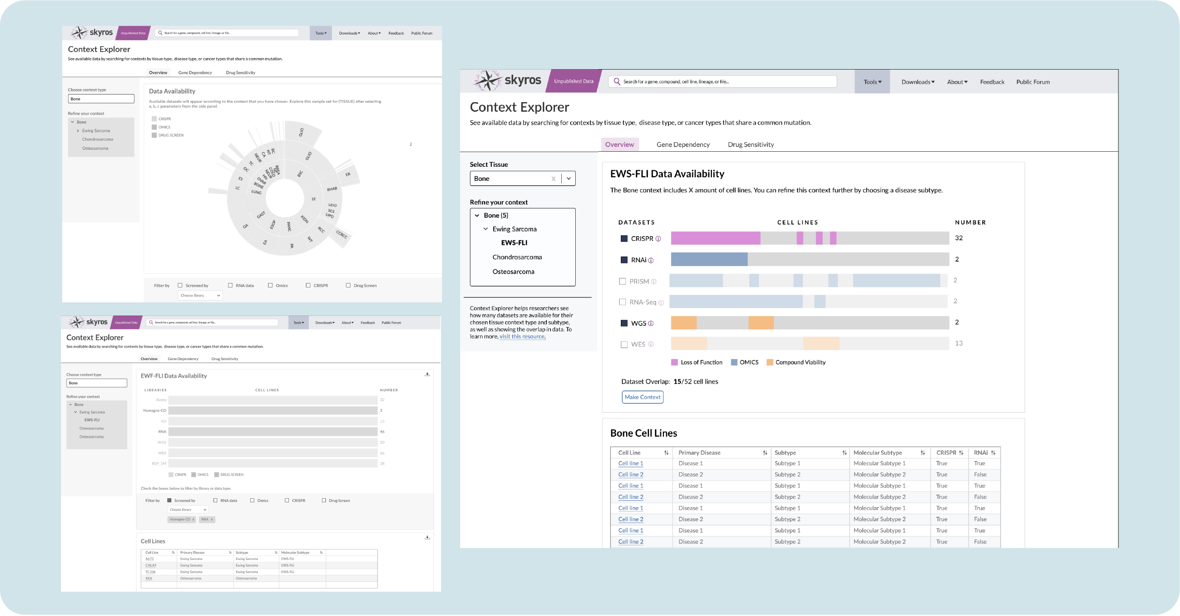
As I iterated on the design, my engineer clarified how the data was imported and processed. Initially, the shading on these charts represented individual cell lines, but our engineer noted that it would take too much processing time to render each line individually along with a placeholder for absent lines. This would slow our application down. So I opted for solid groupings that had less granularity, but would show the overlap when clicked.
Collapsible box plots for faster comparison
We needed a way to compare the chosen lineage with other lineages that may have similar dependencies. This is helpful in exploring whether a targeted gene only occurs in that lineage and would need a new or unique therapy, or appears in multiple lineages so various, or established, therapies could work to fight that cancer.
Researchers are familiar with box plots as a way of exploring lineage; my design has them populate a side panel when you click on a gene. Initially I had them arranged vertically, but the allotted real estate only allows you to compare two lineages. I tried a horizontal design, but with some lineages, as much as 26 (!!) box plots could appear.
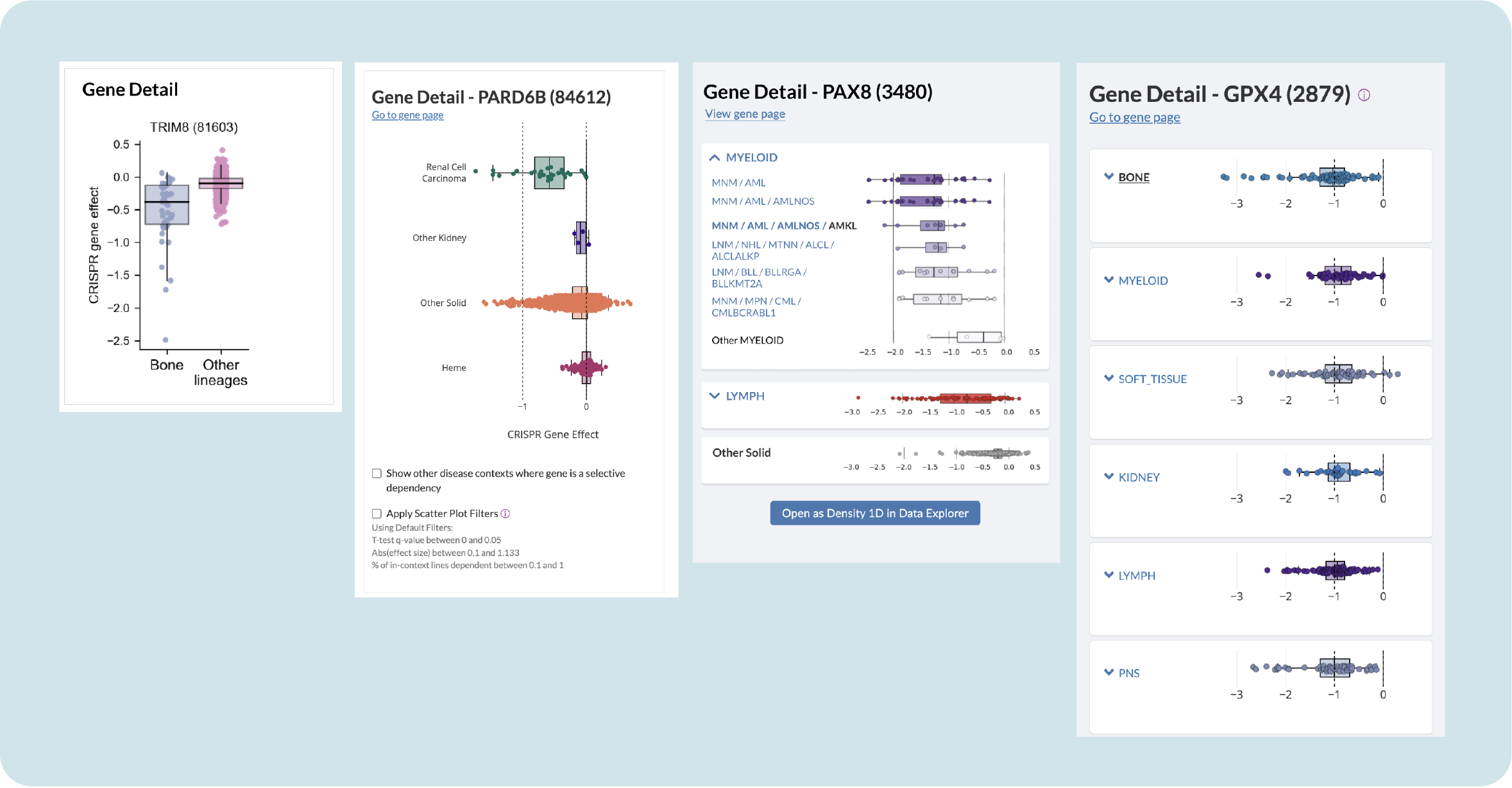
Testing with users revealed that they really dislike having to scroll up and down to compare outliers in lineages, so I proposed containing the plots in collapsible containers. This allows you to get an overview and then expand to further explore subtypes without congesting the panel.
Improving Context Explorer through evaluative user sessions
We launched Context Explorer internally in December 2023 and had 20 internal users complete a structured task. Our users found the visualizations helpful in selecting lineage-related datasets through the ability to easily see overlaps. Obviously, there were areas to improve:
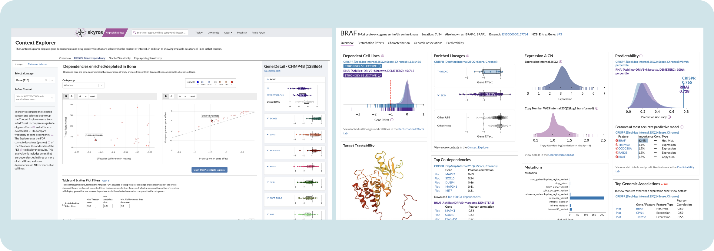
Our users were overwhelmed with the initial volcano plots in the Gene Dependency tab, so we changed them to simplified scatter plots in order to reduce noise
Some thought that the Gene Dependency tab was broken because sometimes the plots remained empty. It was unclear that certain disease subtypes did not yet have enough data to show results, so I added identifiers, tooltips, and help text to clarify this
They asked if it was possible to browse by molecular subtype, add specific disease subtypes, and expanded compound (drug) information
A 2.0 version with these adjustments was shipped in November of 2024 for internal institute use and publicly launched in February of 2025.
Final outcomes and reflections
Since its launch in 2023, Context Explorer has reduced the time it takes to collect and analyze data by context by 50%. Researchers have noted that they no longer need to open multiple pages or keep a separate spreadsheet of notable cell lines. Giving users the ability to open generated scatter plots in Data Explorer reduces time spent cutting and pasting parameters.
My design for Context Explorer has served as a template for new portal tools, reducing the cognitive load associated with using a different tool by offering users a familiar interface. The collapsible box plot design is now the portal standard for comparing gene sensitivity in disease lineages, replacing static box plots on all main overview pages.
Reflection
This project was an exercise in compromise; factors like data loading time impacted the design choices I made. Making a fancy visualization is meaningless if it takes forever to load; users will abandon the tool if it doesn’t function quickly.
It also revolved around an area of cancer research that I was not familiar with, so I had to lean on my subject matter experts to help me understand lineage and disease contexts. When working with scientists, it’s easy to get intimidated and try to figure things out on your own. But you have to let go of the ego and just ask the “dumb” questions; they’re always happy to lend their expertise.