
DepMap Compounds
Visualizing Cancer Drug Efficacy
Cancer drugs are most effective when the dose is able to target mutated cells without harming healthy cells. While DepMap provides visualization tools to help scientists investigate dosage and viability, outdated and unintuitive tools can derail research and be prone to lethal errors.
Role
Lead UX/UI Designer
Collaborators
2 Computational Biologists
1 Front-end Engineer
1 Visualization Engineer
1 Full-stack Engineer
Stakeholders
Cancer Data Science Leadership
Duration
6 months (2025)
-
DepMap is a cancer research platform that provides screened cancer data and analysis tools, helping an average of 500k researchers per year discover new targets for therapeutic research.
Our drug discovery researchers needed updated visualization tools to investigate newly screened data. The main stakeholders asked for simple adjustments to existing tools, although user studies revealed additional pain points worth addressing.
I translated these findings into a strategy and scope that delivered 6 overview visualizations, 3 new visualization tools, and a major import/export feature in two design and build phases spanning six months.
Initial impact was measured by task completion time; researchers found ideal targets in a 1/3rd of the time it normally took, as my strategy consolidated information and allowed them to easily import and export customized contexts to and from other tools.The ultimate validation lies in whether our researchers cited the use of these tools in a published manuscript. At this time, the flagship manuscript has been submitted and is currently in peer review.
What is DepMap? What are Compounds?
DepMap is a cancer research platform ecosystem that allows an average of 500k researchers per year to download and analyze cancer data that is screened in-house by computational biologists. DepMap provides 14 data visualization tools and terabytes of data sets and files that fit in two overall categories: Gene (genetic variants, mutations, and sensitive lines) and Compounds (small molecule drugs).
Scientists use DepMap to identify dependent cell lines (cancer needs these lines to survive) and identify targets that are vulnerable to compounds (the drugs that limit survival). For example, a researcher studying lung cancer will look at EGFR (a gene), as lung cancer depends on EGFR mutation for uncontrolled growth. They use Overview visualizations to understand if it appears in other tissues, if other genes are dependent, and which compounds it is sensitive to. They can then use our analytical visualization tools to find relationships, targets, and correlations that validate initial hypotheses and pave the way for extensive research.
The challenge: DepMap produced new compound data, but couldn’t investigate it
At the time of this project, DepMap’s computational biologists had completed screening an entire compound oncology reference dataset (OncRef), opening a new dimension for drug discovery. Everyone was excited.
DepMap had extensive tools and visualizations for genes, but had limited and outdated offerings for compounds. Researchers were not using DepMap tools to investigate compound data; they were mostly relying on Excel and PRISM, a separate visualization tool built at the Broad Institute.
OncRef data had limited usage permissions, so you couldn’t use PRISM or other external tools. So DepMap needed to improve its tools and visualizations, otherwise this data was useless.
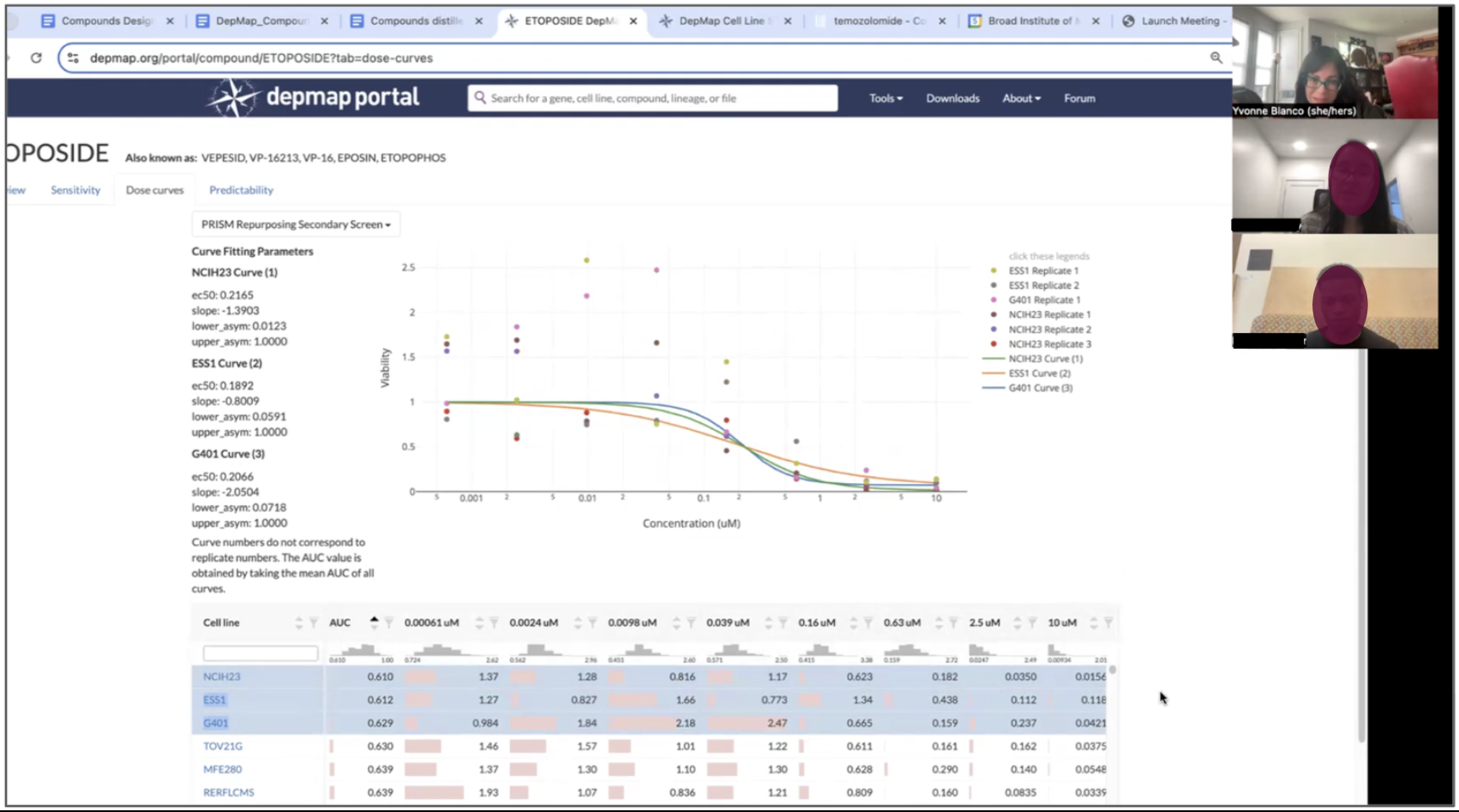
The state of the DepMap Compound Overview page (left) and Dose Curve tool (right) in early 2025 before I started this project. Previously designed in 2018, they lack guiding text and emphasis for actions. “I'm not really sure what I’m supposed to do here, can you help me?” was a common question about the Dose Curve in our forum.
Our Goal: Improve our Compound tools
Wait, what does “improve” mean?? To our stakeholders, it means achieving parity with our Gene offerings. But it’s not that simple–compound information is radically different than gene information. Compound researchers are hoping to answer the questions: “What can I learn about this compound, what does it target, why is it useful, and is it worth investigating at length?”
We want to reduce the amount of time it takes a researcher to identify useful targets for a compound and enable them to quickly export findings to other tools for secondary analysis.
Our stakeholders came to the kickoff meeting with a list of proposed improvements. I knew little to nothing about compounds, so I used this opportunity to deeply investigate how compound researchers work, what are they looking for, and what is unnecessary or confusing about our current tools. Translating these insights into requirements that mirror their investigative workflows helped to ease ambiguity over whether we were building the right thing.
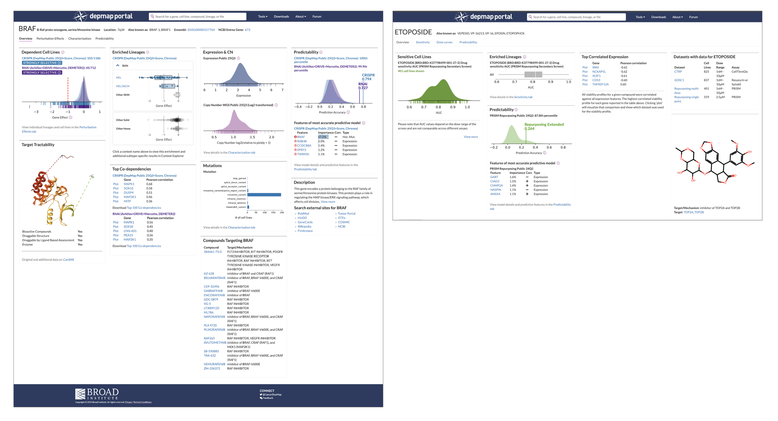
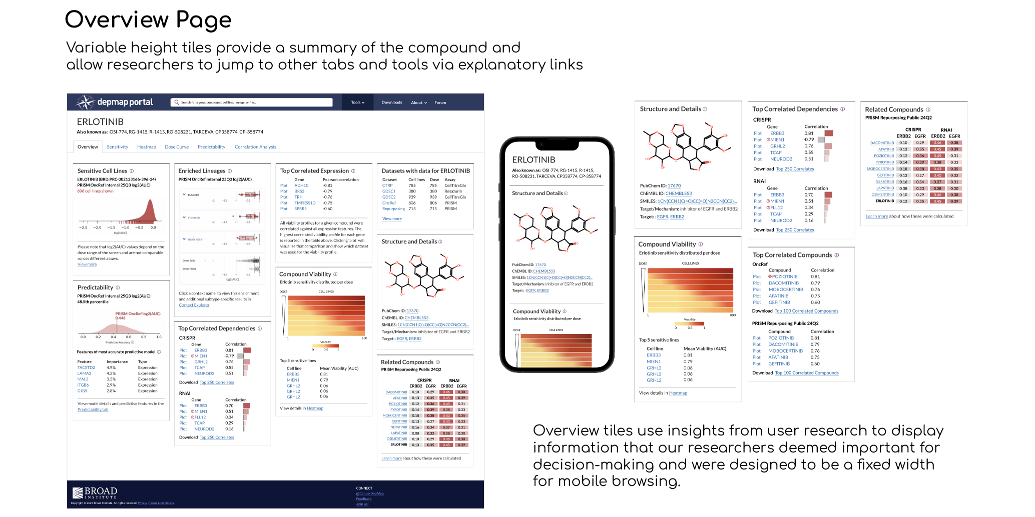
An example of what “achieving parity” means: When you search for a gene, the Gene Overview page (left) provides 9 tiles of information, with links that serve as pathways to visualization tools. The Compound overview page contains 5 barely descriptive tiles (the structure doesn’t even have a title) and feels like an afterthought, eroding users’ trust and prompting abandonment “This isn’t useful, so I’ll find something else.” So more information is necessary, but we need to understand what information researchers need so that we don’t overwhelm them.
Our Solution: A suite of 5 overview visualizations, 2 new tools, and one massively upgraded Dose Curve
User interviews revealed that Compound Researchers are interested in seeing the overall trend for lethality and viability first, then want to dig deeper and get super granular. I translated these findings into a strategy and scope that delivered the suite in two design and dev cycles, split into agile sprints spanning six months. In that time, we shipped:
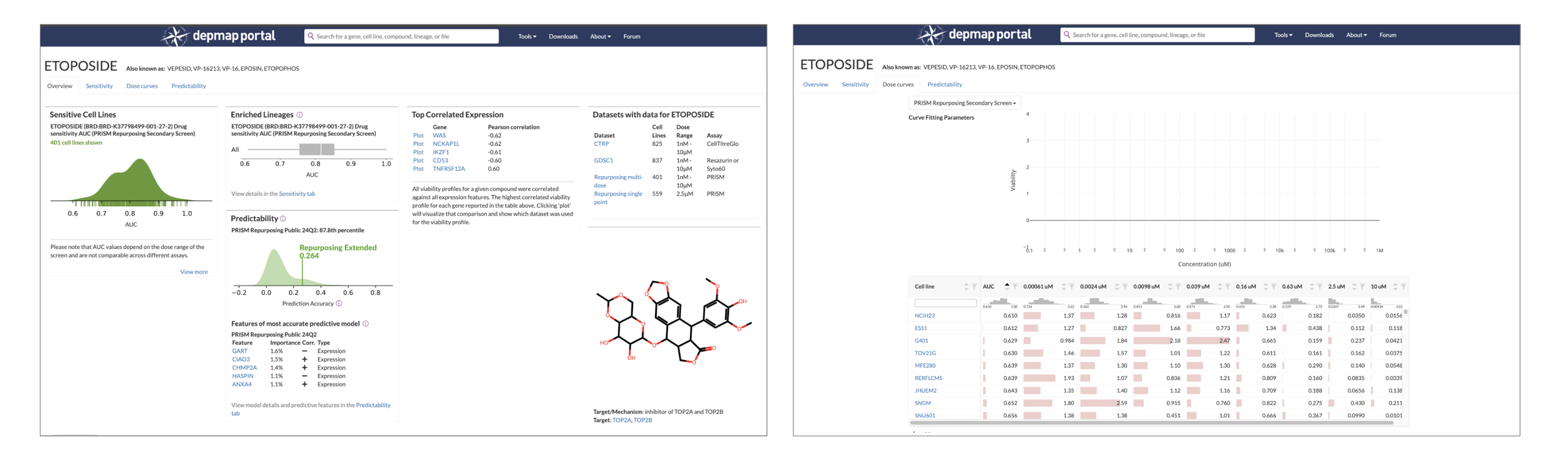
5 tiles for the Compound Overview page that detail the chemical structure, related compounds, correlated dependencies, and heatmap snapshot, along with links to related tools
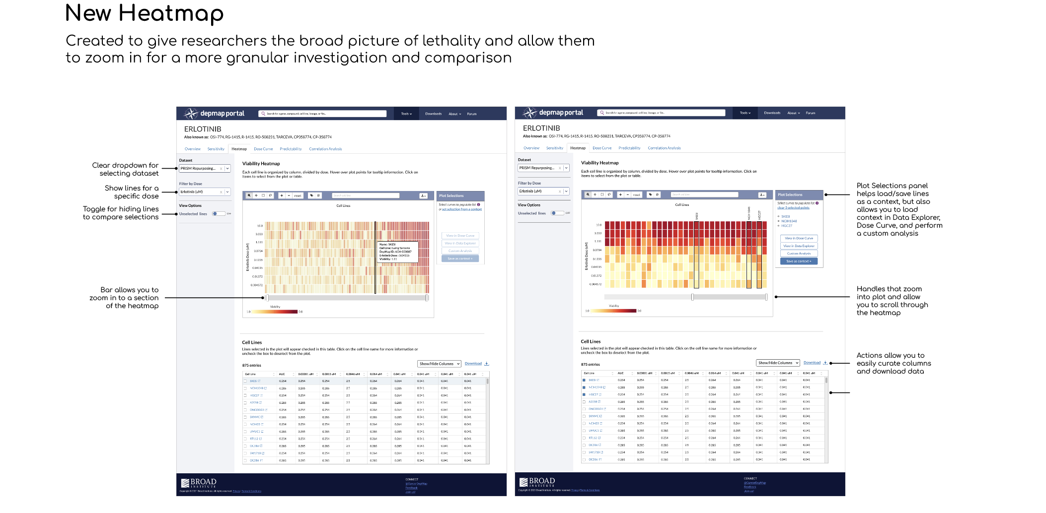
A new Heatmap visualization tool that helps researchers understand overall toxicity, then zoom and select individual cell lines and doses
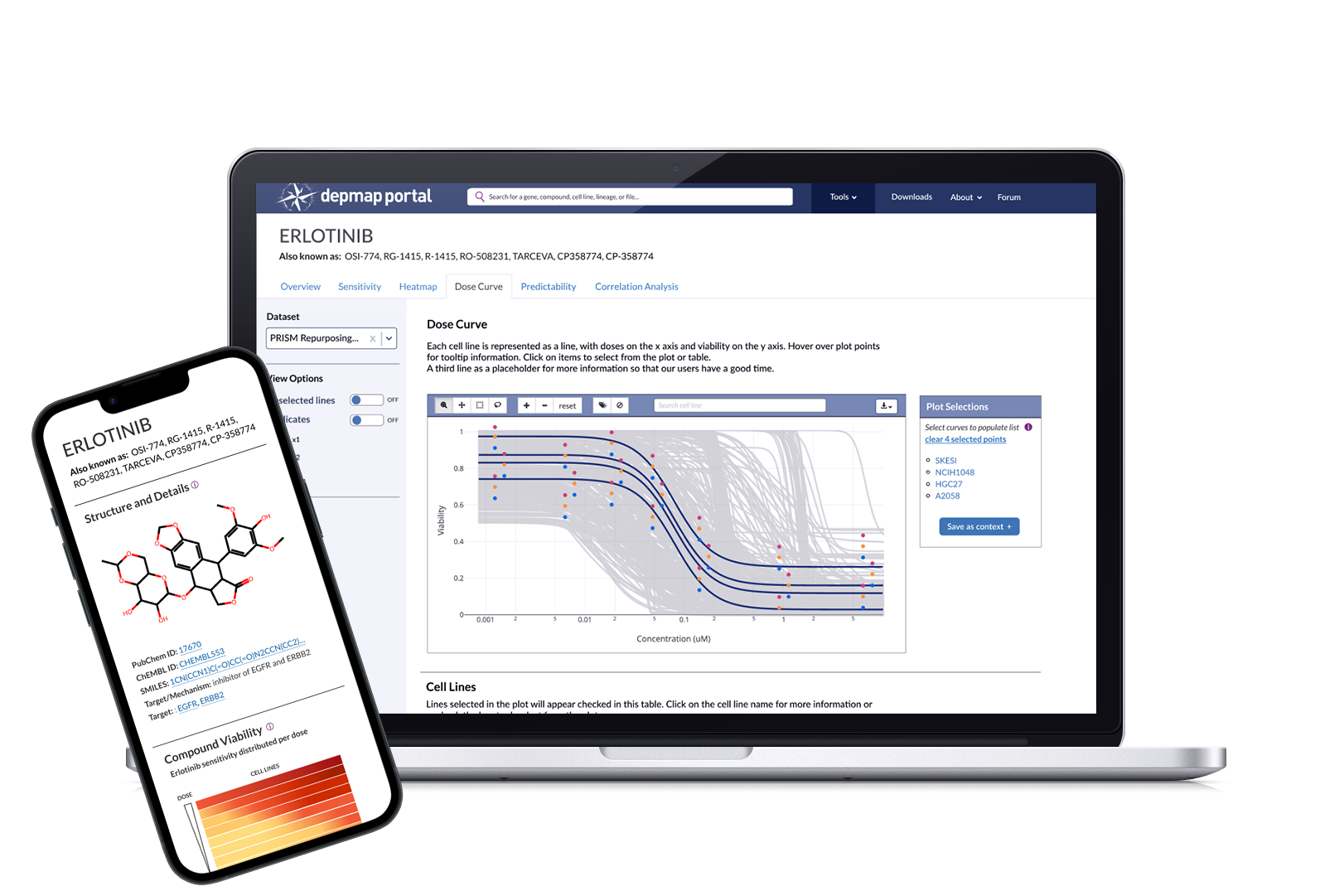
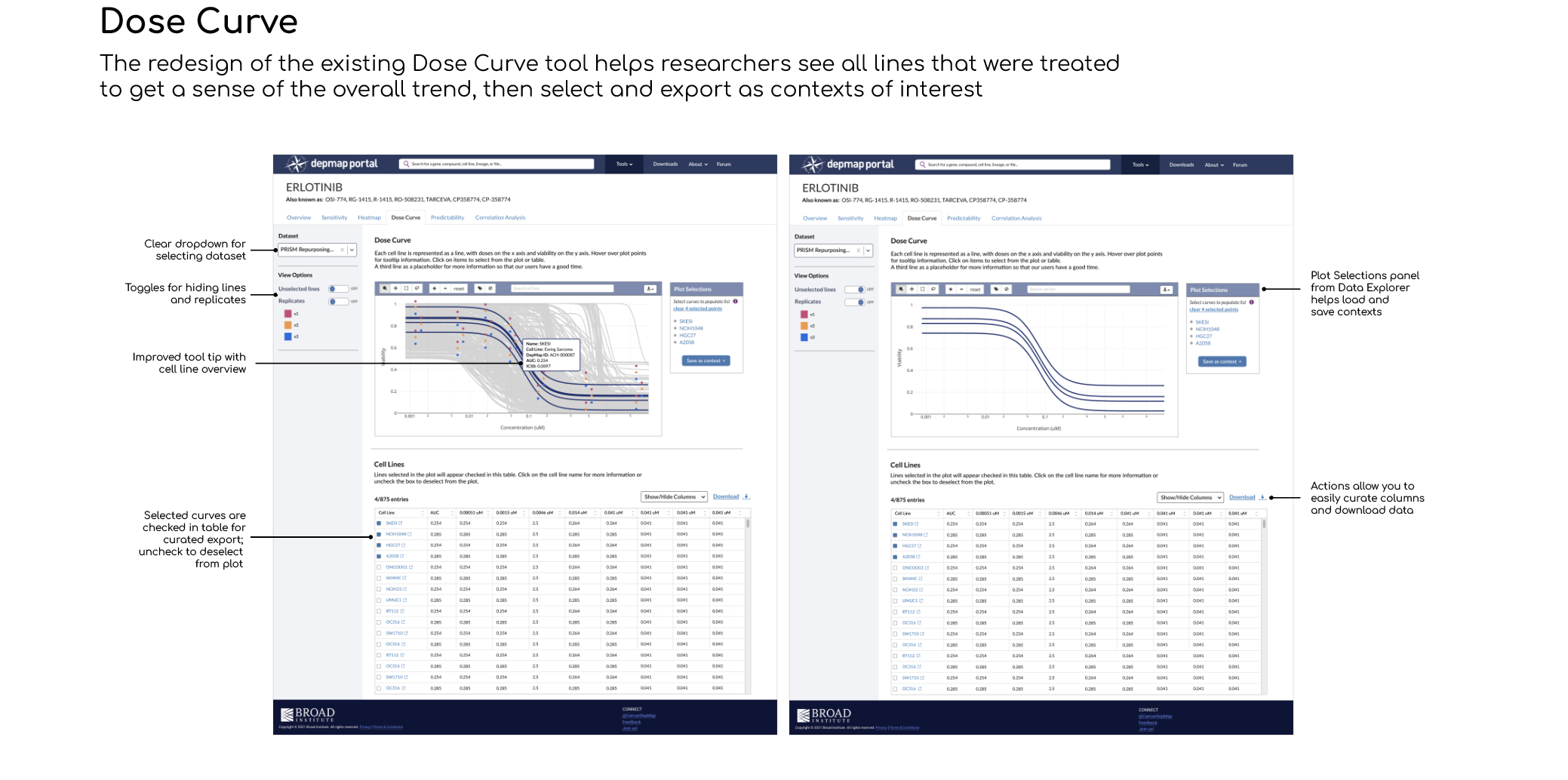
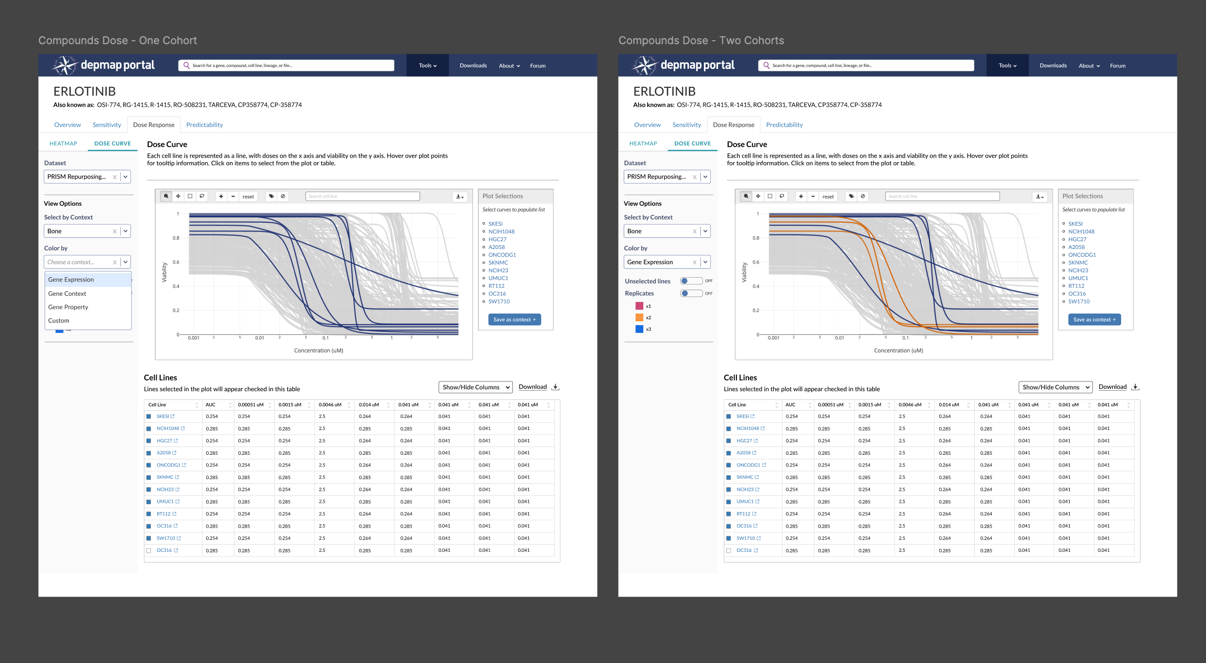
An improved Dose Curve visualization for seeing the overall trend in viability, connected to the heatmap for better portability of selected cell lines and doses (no more copy/paste!)
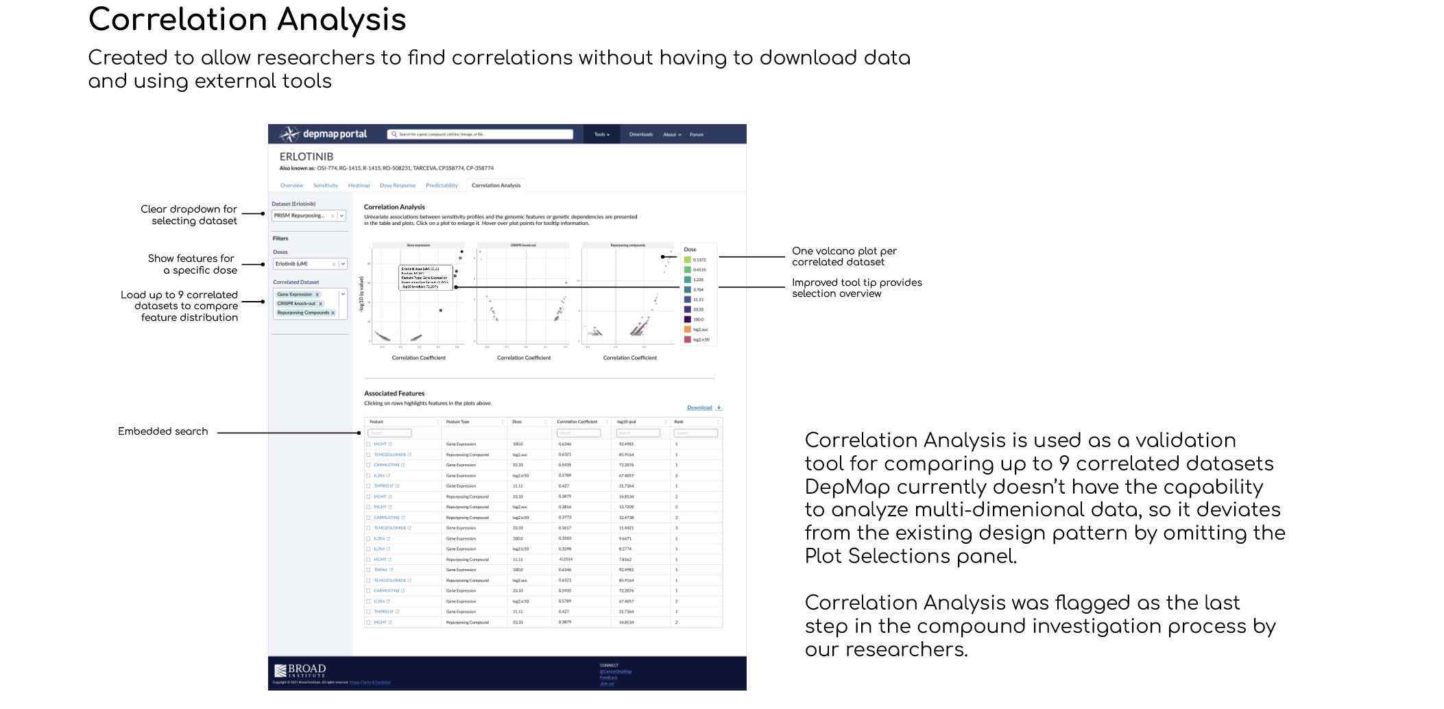
A New Correlation Analysis tool that lets you investigate individual gene features with information from the Heatmap and Dose Curve
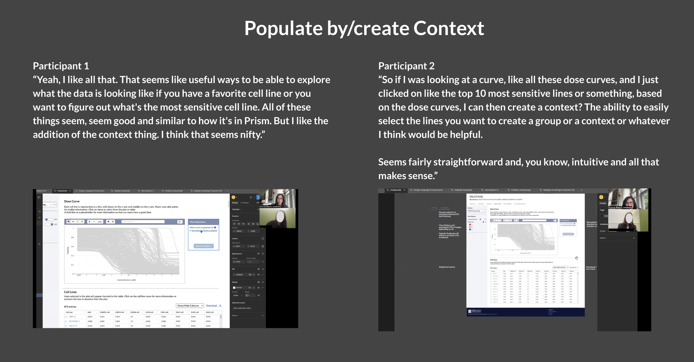
A feature that collects selected cell lines and saves them as a “context”, giving you the ability to curate your own selections instead of having to start from scratch every time

Impact
The new designs eased confusion and guided researchers through their discovery journey, reducing the time from initial curiosity to identifying a viable target by 60%.
My proposal to repurpose the Plot Selections panel from Data Explorer reduced dev time by 2 full sprints.
I insisted on defining a measurable metric of success with our stakeholders. We mutually arrived at “researchers cite our tools in a publication”. As of Feb 2026, a flagship manuscript on OncRef data analysis is currently in peer review and cites DepMap Dose Curve and Heatmap usage.
Stakeholders that were initially averse to user research changed their mind once I presented validating insights; I was then asked to create a user research protocol and SOP for all future design endeavors.
My contributions and constraints
I volunteered to drive this project, so I collaborated with the Subject Matter Experts (SMEs) and Stakeholders to define the problem, goals, and scope. I managed the end-to-end design process, conducting user research and validation, documenting solutions, creating flows, wireframes and high-fidelity UI designs, contributing to the design system, and working with a cross-functional team to align designs with DepMap’s goals.
We had several high-priority items in our roadmap and limited bandwidth from engineers, so I was discouraged from proposing a complete redesign of Overview pages. This was a “work with what we have to meet the deadline” situation and I had to stick with existing react components and plotly.js visualizations.
Process: Designing the Dose Curve Visualization
Let’s take a look at the process for the Dose Curve, which was deemed the highest priority based on a RICE scoring model exercise. This design became a template for the Heatmap and Correlated Analysis tools.
Dose Curve visualizations show the relationship between the amount of a drug administered and the resulting effect on an organism. It helps researchers determine a drug's potency, efficacy, and safety.
Depmap vs PRISM Dose Curve Analysis + Comparison
PRISM is a sister lab to DepMap that specializes in screening over 900 cancer cell lines in order to understand drug response. Their visualization tools are nicely designed, but due to security limitations, unable to integrate with DepMap data and visualize the new OncRef dataset. I conducted a visual analysis to compare both tools and highlight what works and what doesn’t.
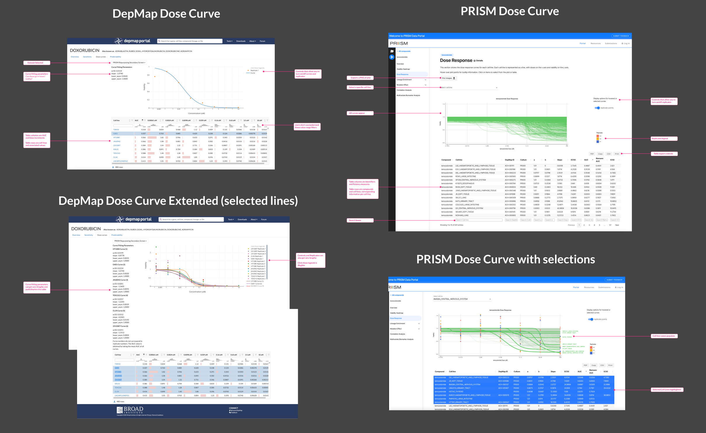
This analysis highlighted the limitations of DepMap’s Dose Curve in terms of lack of labels and instruction, long lists of confusing parameters, and unclear interactions. The most alarming being that, in order to populate the plot, you had to click inside the table but NOT on the cell line name (that took you to a separate cell line information page). PRISM had clear instructions and a seamless click-and-select interactive pattern, yet could use improvement displaying table data and selection-to-export functionality.
What do our researchers need?
I interviewed 5 compound researchers; choosing a small cohort was deliberate in order to gather key insights within a two week timeframe. I structured the interviews as cognitive walkthroughs, first reviewing the existing DepMap Dose Curve tool and then shifting to a walkthrough of the Dose Curve in PRISM, using a non-direction technique to remove bias and gather these insights:
Researchers found the DepMap Dose Curve tool confusing due to lack of guidance/instructions; preferring to use the PRISM portal instead
However, the PRISM portal did not have features like turning off unselected curves or filtering by lineage, which they felt would be extremely helpful to reduce noise
They preferred starting with a populated plot to get a sense of the trend and then select individual lines in order to curate a cohort for further analysis
All noted that it would be great to export this cohort directly into the Data Explorer tool for further analysis
Interviews were transcribed using Dovetail and leveraging their AI features to quickly find common themes and pull insights to investigate. I always double check an AI insight because qualitative interviews rely heavily on context and AI can initially dismiss words (like “ugh, I dunno what this is”), a heavy sigh, or a look that signals frustration and unearths a problem to solve.
User stories based on research
I translated these findings into user stories to frame researchers’ needs in order to get buy-in from my stakeholders:
As a researcher conducting an initial inquiry, I am interested in viewing the dose response for one cell line, or of a defined group or cohort, and ignore (hide) all curves outside of these selections in order to investigate it in isolation within the plot.
As a researcher focusing on comparing cohorts, I want to group selections as a context, then load a new context to compare within the same plot.
As a researcher focusing on exporting a group for analysis, I want to select a group, such as the most sensitive (or least sensitive) lines, and save multiple selections as a context.
As a researcher writing a manuscript or presenting research, I want to export a table of all dose response data for all (or a chosen subset of) models, and/or a PNG of the modified Dose Curve plot.
Initial Scope and Wireframes
The Dose Curve MVP must haves:
Initial description of the tool and 2-3 instructions on how to use it (shift+click to select multiple lines, etc.)
Side panel containing input fields, parameters for adjustment, and filters that adjust the plot and table
Interactive curve plot with all lines populated, select/deselect, and grouping functionality
Simplified table with dose values per cell line, with export functionality
Nice to haves
Mechanism for loading and exporting a context
Functionality for comparing two groups within the plot
Quick animation for loading dose curve lines
This scope and initial wireframes were presented to our group of stakeholders and engineers to discuss whether this design is realistically feasible given constraints with bandwidth and functionality.
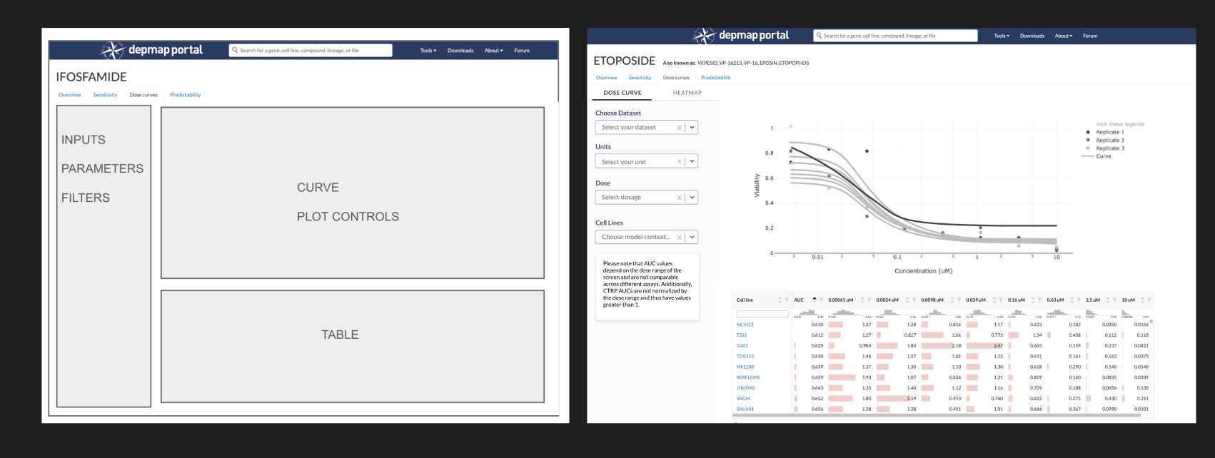
These were a mix of screenshots and components from my design system.
Iterations and Trade-offs
Loading a context
Initially, I designed the side panel to have input/dropdown menus for loading a context, since it affects the entire plot and table. Our SME asked “What if you need to change the context, or add another one? Does another input box appear, or we have multiple input boxes?”
Our goal is to simplify, not complicate, our interface. I looked at what the design pattern is for loading/saving contexts in other tools and proposed that we add the Plot Selections component used in Data Explorer. This creates a list of selections that allow the user to add or remove lines, and then export the list as a context. It also allows you to load an existing context to populate the plot. Researchers are familiar with this pattern, so it will reduce their cognitive load.
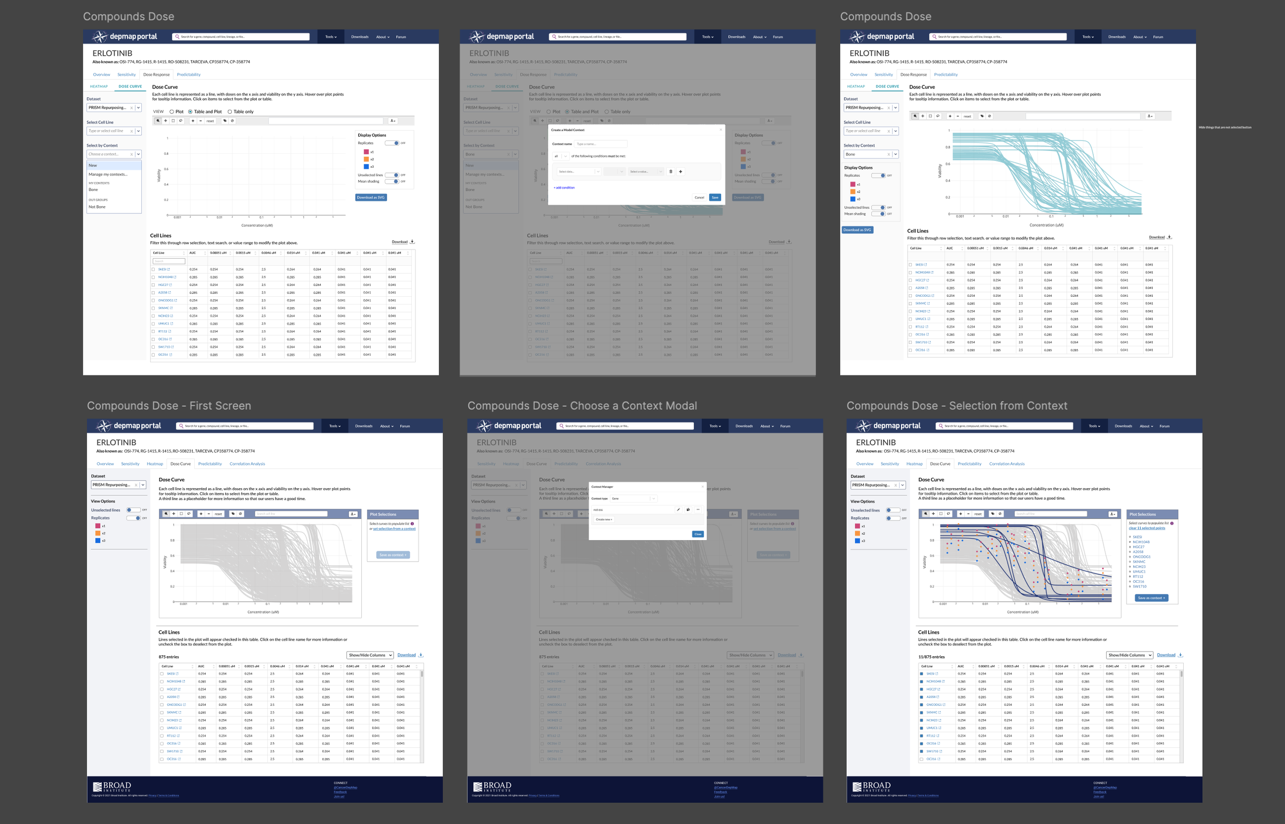
Simplifying the input and filters panel
The side panel contains inputs and filters that affect both the plot and table. Initially, I had dropdowns for dose, units, cell lines, and context. Testing revealed that users don’t filter a Dose Curve by dose, units, or cell lines, so I eliminated them. After solving the problem of how to integrate context selection, I left Dataset Selection as the sole dropdown and added view options beneath them, which got simplified to two toggles with core show/hide functions for lines and replicates.
You’ll notice toggle buttons for Heatmap and Dose Curve on top of the side panel in earlier iterations. Originally, the Heatmap and Dose Curve were going to be contained within one tab (Dose Response) as researchers noted that they looked at the Heatmap first and then inspect further with the Dose Curve plot. The idea was that selections made in one would automatically appear in the other. My engineer noted that this would be difficult to do and have a high margin of error, so I eliminated the toggle and designed each tool on its own page, bridged by the Plot Selection panel: save a context of selections in Heatmap, then load the selection in Dose Curve with two clicks.
Eliminating the ability to compare two cohorts in the same plot
This proved to be more trouble than it was worth, because the Plot Selection component does not allow for grouping or differentiation, so we’d need to create a new component that allows a user to group selections and then color them differently to facilitate comparison. The export function doesn’t support creating multiple contexts at once. We had other tools to build, so we decided scrap this feature and guide users to compare cohorts in Data Explorer. After launch, we’ll reassess whether it’s worth reawakening this beast.
Animating Dose Curve lines delays loading time
Not gonna lie, this one kinda broke my heart because I wanted to inject some delight into this visualization by having all the dose curves run from left to right. My engineer, who was also compiling the data that populates the plot, explained that compounds will have 800-1000+ dose curve lines and having them animate would delay loading by more than a minute. We can’t risk our researchers abandoning this tool because it takes too long to load a 2-second animation, so I conceded.
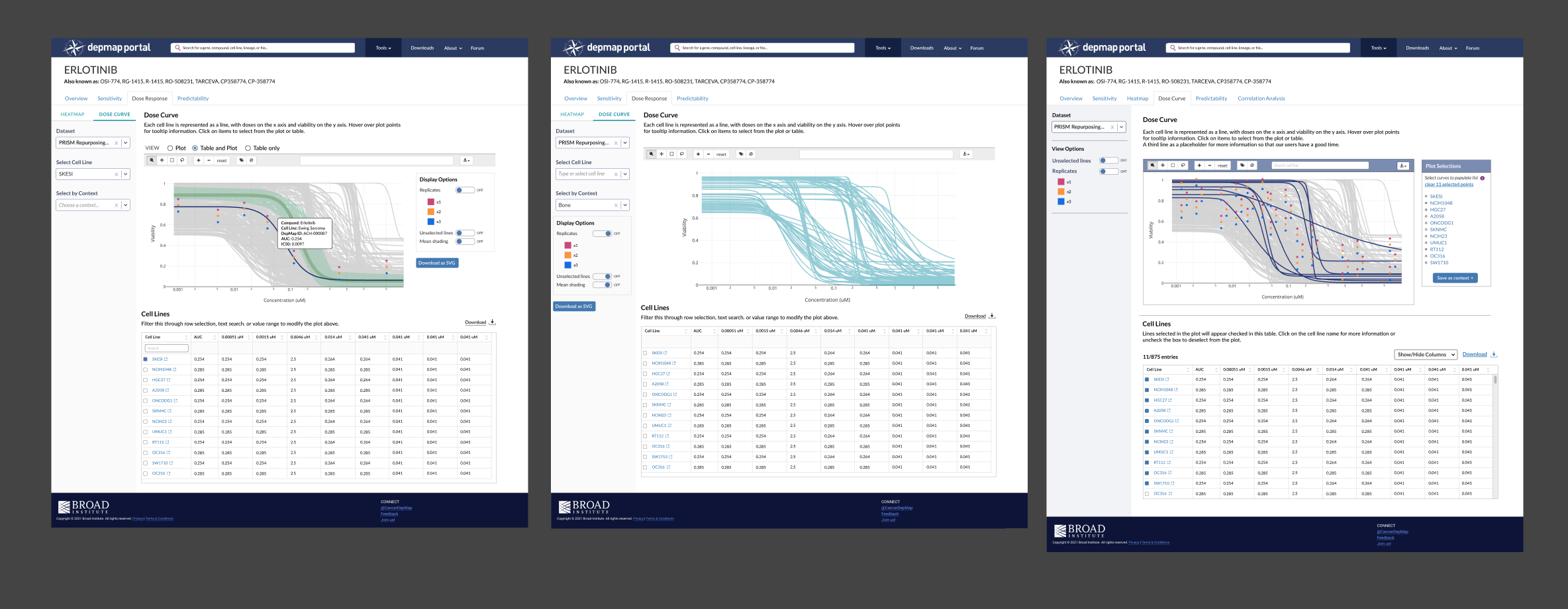
Testing + Validation
I had our initial cohort of researchers test this design, focusing on the loading and creating a context feature. They reacted favorably to this design; using the panel from Data Explorer proved to be the right decision as they were familiar with the functionality and didn’t have to guess at how they could save their curated selections.
Reflection: Unexpected Wins and Room for Improvement
The Dose Curve and Compound suite was deployed on DepMap's internal platform, which is available to approximately 5k affiliated scientists. It will be released publicly once the manuscript is published. The screenshots below show publicly available PRISM data in order to not break the embargo.
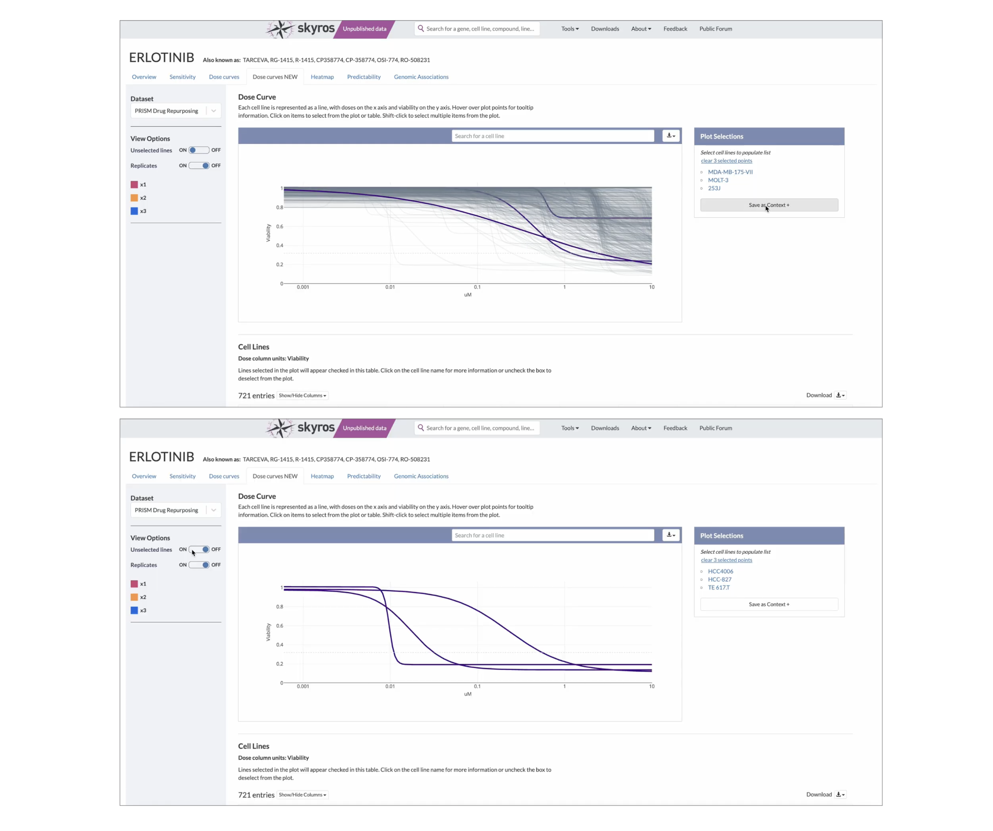
While there are a few bugs to be worked out (the plot shrinks when replicates are activated), our researchers have been using these tools to browse and analyze the new OncRef dataset, citing the Dose Curve and Heatmap in an upcoming research manuscript in their methods.
An unexpected win for user research
Previously, the DepMap stakeholders didn’t want to conduct user interviews or studies as they believed it would take too long and users would just provide a list of demands. By having stakeholders quietly observe interviews, they saw researchers make mistakes, navigate a tool in a completely different way, or express joy when a task became less difficult after a redesign.
The opinion changed from “user research is too expensive and time-consuming” to “Wow, we should do more of these. How do we go about it?”
I was asked to develop a protocol for user research: when it should be conducted and which methods to use. By proving the value of insights generated and demonstrating that it could be done quickly, their opinion on user research changed from skeptical to optimistic.
What I would have done differently
Stakeholder buy-in is important, although after reflecting on this project, I spent more time convincing stakeholders about its value than conducting the research itself. I wonder if I had taken a “Ask for forgiveness, not permission” approach and stealthily conducted the research, we could have made the decisions that shaped our MVP requirements faster.