
Data Structure Overhaul + Hub
Role
Evaluative Research,
UX/UI Design
Collaboration Partners
1 Computational Biologist
2 Engineers
External Stakeholders
CDS Program Manager
CDS Leadership
Timeline
3 months (Data Explorer)
2 months (Data Hub)
Introduction
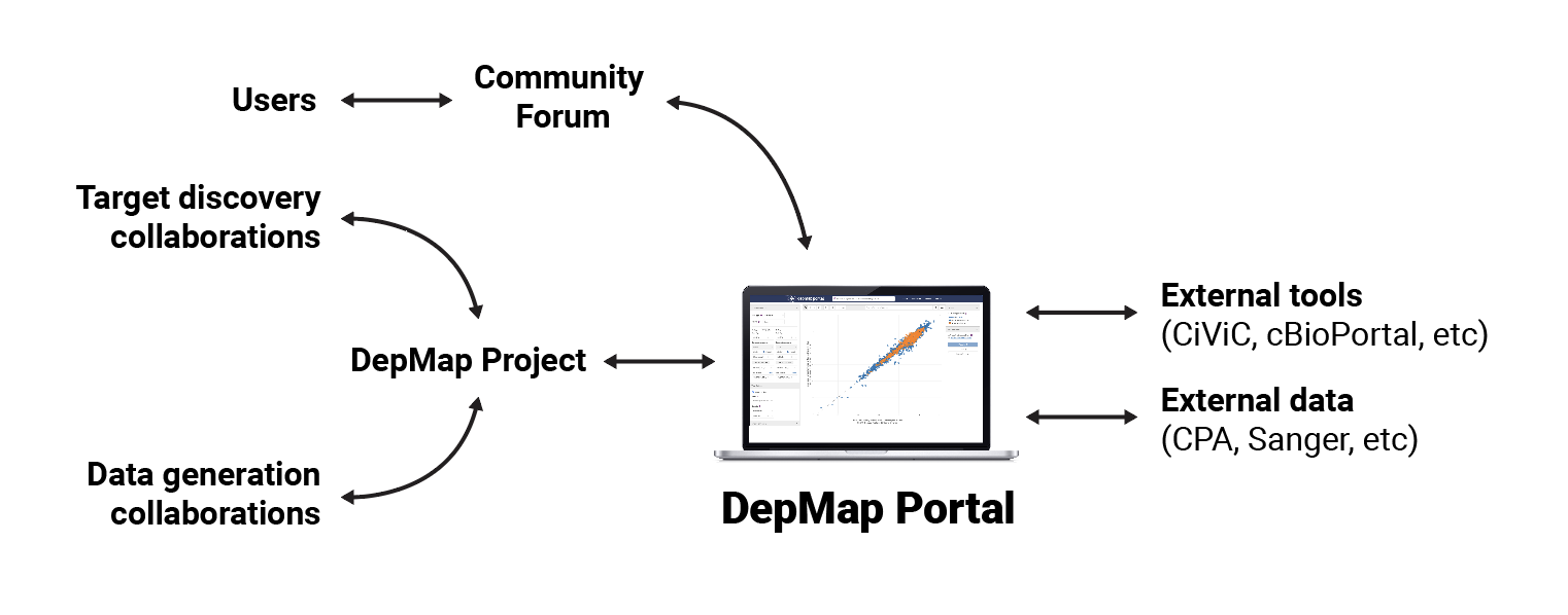
The Cancer Data Science team produces terabytes of data, spanning approximately 1300 cell line models that represent the diversity of human cancers. The DepMap portal contains tools that allow scientists to analyze that data and export the results in order to fuel their research.
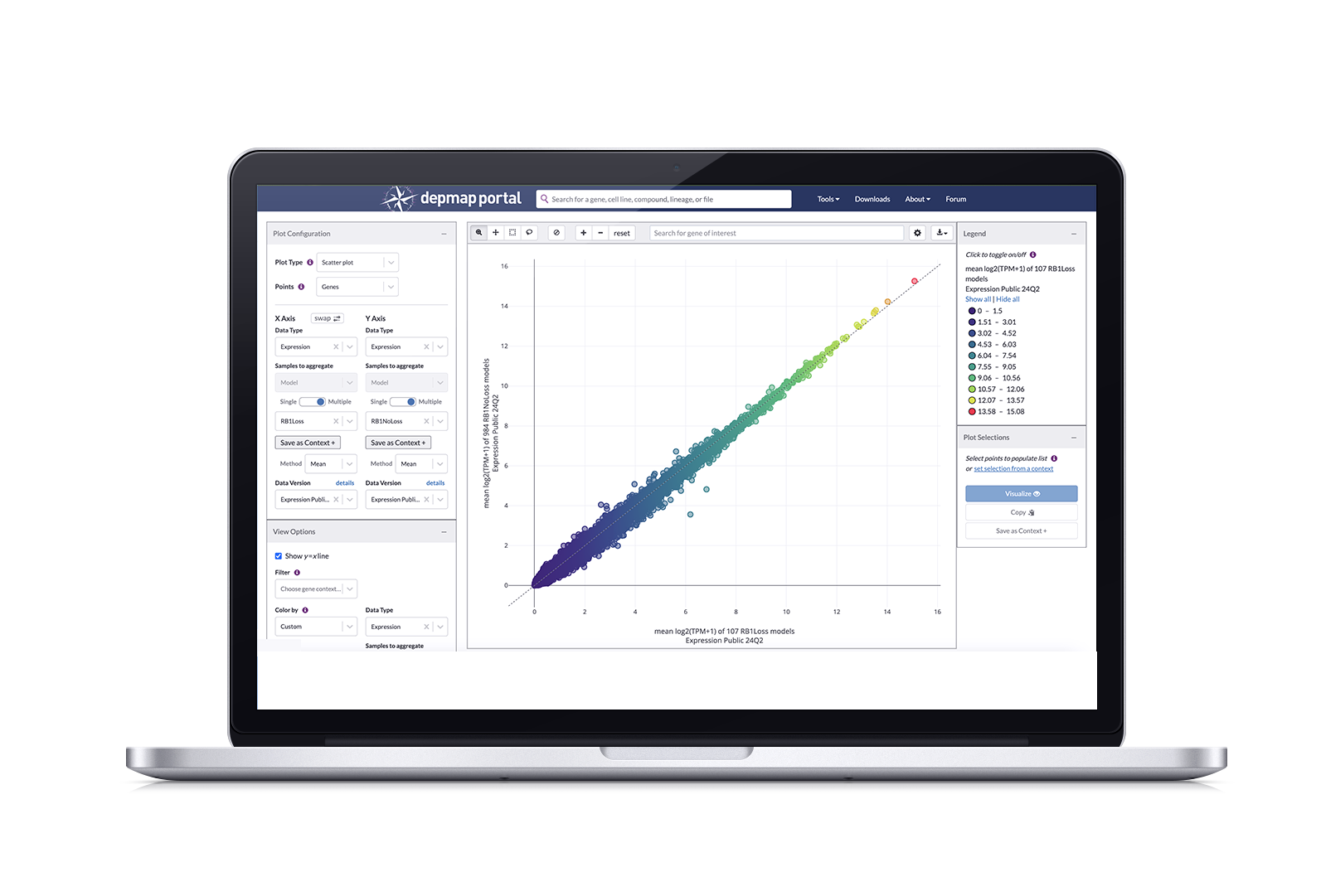
The flagship tool is Data Explorer, which pulls directly from screened DepMap data and allows you explore relationships, such as dependencies between genes, correlations between compounds and genetic targets, mutations, and expressions through visualization plots. In late 2023, a new version of Data Explorer(2.0) was launched allowing users to have enhanced plot configuration, allowing them to plot genes, compounds, and gene pairs (the previous version only allowed models as plot points) which yields more granular results.
Our Challenge: Streamline dataset selection experience in Data Explorer
After Data Explorer 2.0 (DE2) was launched, we conducted a user study with computational biologists. We asked these scientists to walk us through how they conduct their research with DE2 and we noticed that every scientist had difficulty selecting, or expressing confusion over, the correct dataset for their generative analysis.
The main confusion stemmed from having to scroll through a dropdown menu that contained 69 named datasets, most having similar names. In order to know whether the dataset contained the correct data, you had to look up each dataset through a separate download page and clicking “download”; only then would a modal with information about the dataset pop up.
We had two goals:
Restructure our data by organizing them into categories so that there are fewer options to choose from
Design a way to provide all the necessary information without having to leave the Data Explorer application
Solution: Data Structure Overhaul and Data Hub
Dataset selection in Data Explorer
A newly designed flow and UI for dataset selection in Data Explorer that leverages these features to reduce time spent investigating data:
Datasets are organized by data type, reducing the dropdown list from 69 to 13
The default dataset (usually the most current version) for each datatype is automatically assigned after selecting type
A tool tip and button added to the interface that pulls up a modal with more information on the selected dataset, along with menus that allow you to choose a different version or dataset
We didn’t stop there! Our data structuring exercise inspired me to redesign the data downloading experience for DepMap as a whole, consisting of:
A hub that contains everything related to data, including a tab for overview information, our current release and a redesigned Downloads page
Structuring release data according to data type, arranged in a tab sub-navigation that allows you to toggle between types
Displaying datasets in collapsible rows that can be expanded to show information about files, including metadata and sources
Non-release datasets are organized by version and displayed as collapsible rows
Strategy and Impact
Screened data is the main export of DepMap and Cancer Data Science; we have unique pipelines that our competitors don’t have access to. Along with increased user engagement, the number of datasets downloaded affects how much funding the department receives. Along with the two main goals defined in the Context Explorer case study,
Reducing confusion around finding the correct dataset, measured through task completion and number of downloads
Proof that users are finding and working with the correct dataset, measured through citations in research papers (this one takes a bit longer to materialize)
Working within our biannual release schedule, this project was started in Q1 of 2024, and set the goal of releasing this update in Q224. This was a comfortable timelime for this project and we ended up having extra bandwidth to implement the Data Hub alongside this feature release.
Users have noted that these changes have reduced the time they usually spend investigating datasets by approximately 50%; downloads increased from 10,000 a month to 12,000 (rolling average). In quick user interviews conducted during our symposium, DE users have stated that they are pleased that they don’t have to leave the application in order to validate or change their chosen dataset. This allows them to conduct their generative research faster and confidently export this data for use in downstream analyses.
Process
After identifying this pain point through a user study and looking at the process for investigating data, we reviewed the spreadsheet of the 69 datasets available for use in Data Explorer to figure out how to group them into subsets. Sorting by Data Type would reduce the menu to 13 options; while Feature type had 15 with a few that “depends on the column”. We’re trying to ease confusion, so we went with Data Type as the first level of sorting to reduce options.
We mapped this out and designated a default dataset per data type. From there, I started designing a new UI flow that would ultimately generate a model that would provide the information you would normally find through a multi-step process.
However, because we now have specific features as points (i.e. genes or compounds, etc), there are data types that only work for specific features, such as choosing a Compound as your points where the only corresponding data type is Drug Screen, thus your default option is the only option, so it is locked in. This emerged in later iterations and further prevents you from accidentally choosing an incorrect dataset.
Details about your dataset
We simplified the menu of options and designated defaults. But how can you be sure this is the quintessentially correct dataset?
Sneaking in more information into an already loaded interface is tricky, but not impossible. Using dataset information from our Data page, I mocked up several variations in order to decide whether we wanted static information in a popup or tool tip, or an interactive modal that allowed you to browse other options and potentially choose a different dataset.
In the interest of containing everything and limiting the amount of steps a user has to take, we built an interactive modal that gives a summary of the dataset, the option to download, and a side menu for adjusting parameters and choosing a different version. This modal was initially triggered via a “change dataset” button, but in later iterations where Points serves as an additional layer of filtration, we added a “data version” field that allows you to trigger the modal through a “details” text link.
Side Quest: Create the Data Hub
With all this restructuring, our Data pages no longer made sense as they followed the same conventions. There were two separate pages dedicated to data in DepMap. The Data Downloads page listed datasets by name; each selection had two corresponding tables in sections defining primary and supplemental files. A second page, Custom Downloads, presented files by data type in a vertical list.
This suite had similar and additional problems:
Datasets were organized by name, in a dropdown, so you’d have to scroll through hundreds of names (while DE2 contained 69, this was the complete repository)
The table for primary files was too long, so users missed that there was another section for supplemental files
Information for the datasets was only available after clicking the download icon
Apparently, this was so confusing that users ended up downloading the entire file set from Custom Downloads, only to end up deleting files they didn’t need after waiting an hour for the download
Applying data sorting logic to the hub design
We quickly interviewed 10 super users to find out what information (name, description, date, size?) about datasets would they need in order to confidently select a dataset. We collected this information and further requirement requests in Lucidchart. Rather than have separate pages, we would consolidate all things data into a hub containing four pages: Overview, Current Release, All Data, and Custom Downloads.
For the current release page, we grouped files according to data type and used these types in a horizontal tab menu that quickly allows you to view smaller sets of files according to type. This is a design pattern I created for our Cell Line page. I also suggested more descriptive language beneath the header so that it is clear that the section contains both primary and secondary files in case the primary section gets too long. In the previous Downloads page, the tables got incredibly long and there were no indicators that additional datasets existed, so this would alleviate those painpoints.
I explored and presented medium fidelity mocks on how to best present datasets (cards? tables?). While a card would attractively present information about each dataset, there were too many, which would have our users unnecessarily scrolling. I landed on a collapsible table design, which would take up less real estate while providing the baseline information a user needed.
When closed, each row provides the name, an abridged description, and two actions: download and copy URL (for citations). When opened, it provides a detailed description, column IDs, sources, and citation information. Since the overview row remained constant, users could perform actions without closing or navigating to other pages.
Here’s an unexpected challenge that arose after reviewing with my engineers: While we updated the way release datasets are submitted, allowing to flag by data type, the majority of the entire data catalogue did not contain these categories, so sorting them by data type and using the tab menu would only work for 20% of all entries. Our compromise was to keep dataset information in collapsible rows, but provide filters for our users have more targeted options to choose from.
Results and Next Steps
We continue to refine Data Explorer. We deployed the last round of adjustments to the UI and modal in November 2024 and I’m currently recruiting users for a new user study to gauge effectiveness. Along with validation that this on the right path to alleviating user pain points around data, I’ll be looking for areas of confusion, which will inform the next iteration. I also want to overhaul the current design system and modernize Data Explorer’s appearance. This is an area that has taken a back seat to refining the functionality and experience of Data explorer
The Data Hub deployed in June 2024 and we have seen a 20% increase in data downloads from our Current Release and All Data pages, as well as a drop in entire dataset collections downloaded from the Custom Data page. The Custom Data page design remained unchanged, and this was mostly to see if users were still resorting to using that page instead of the others. We’ve gathered informal feedback from users through our yearly symposium and forum and will be deciding if further refinement is necessary, or if it is fine for now and we should prioritize work on other portal areas.