
Context Explorer
My Role
UX/UI Designer
Collaboration Partners
2 Subject Matter Experts (Comp bios)
1 Full Stack Engineer
Stakeholders
Director of Engineering
Cancer Data Science Leadership
Timeline
8 months
Introduction
In order to accelerate precision cancer medicine, DepMap constructs systematic key datasets and corresponding analytical and visualization tools, using broad panels of cancer models that represent the diversity of human cancers. DepMap averages 10k active users per week and offers approximately 1300 screened cancer cell lines for download and analysis via 14 public and internal tools.
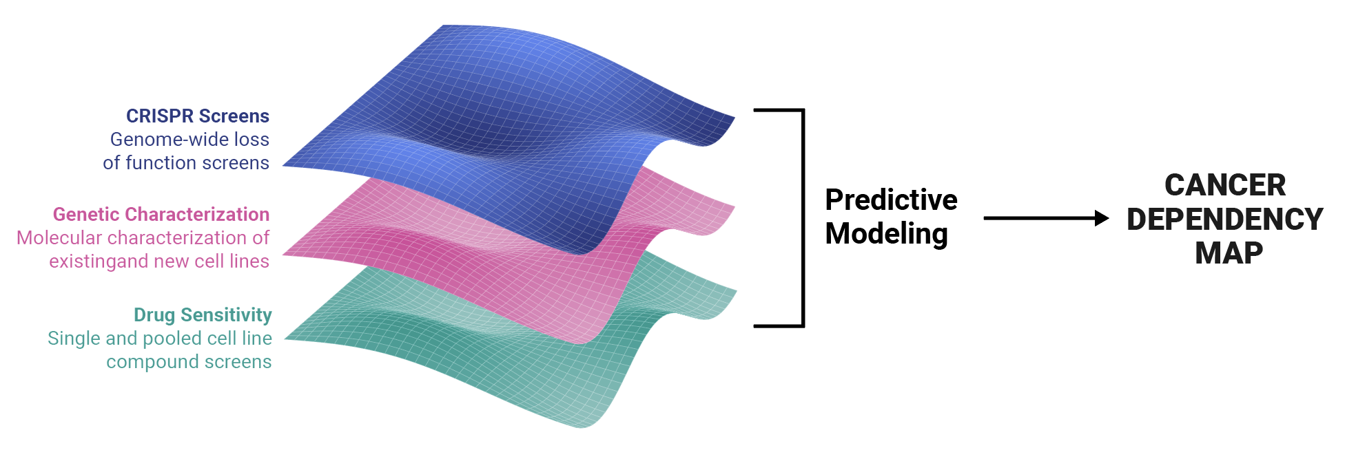
DepMap helps scientists answer generative research questions such as “Given a gene, is it essential to cancer?” and “Are there any cell lines sensitive to a specific compound?” Scientists use our data visualization tools to answer these questions and uncover genetic vulnerabilities that aid in the development of targeted therapeutics.
Our Challenge: Create a new tool for browsing by lineage and context
Our scientists are interested in browsing datasets according to lineage and disease context. They requested that we build a visualization application that allowed them to answer these questions:
What data is available for my disease type of interest?
Given this disease type, are there any gene dependencies that show up more often in this disease?
Are there any drug sensitivities associated with these genes?
How strong are these dependencies and sensitivities?
At the time, DepMap only presented a single page for each disease context and lineage (for example, Ewing Sarcoma, which is associated with bone tissue), which contained two large tables. The first listed all of the cell lines associated with the lineage, but in order to find out if specific data was available, you had to visit the specific cell page. The second listed all drug sensitivity and CRISPR dependency enrichments, which also led to individual detail pages.
This was a messy experience that led to a lot of confusion, page-hopping, and abandoned research.
Our goal was to create a visualization tool that allowed scientists to easily determine which data types are available for each disease context, view associated genetic dependencies and drug sensitivities, and easily export these datasets for further analysis in our Data Explorer tool or their preferred analysis method.
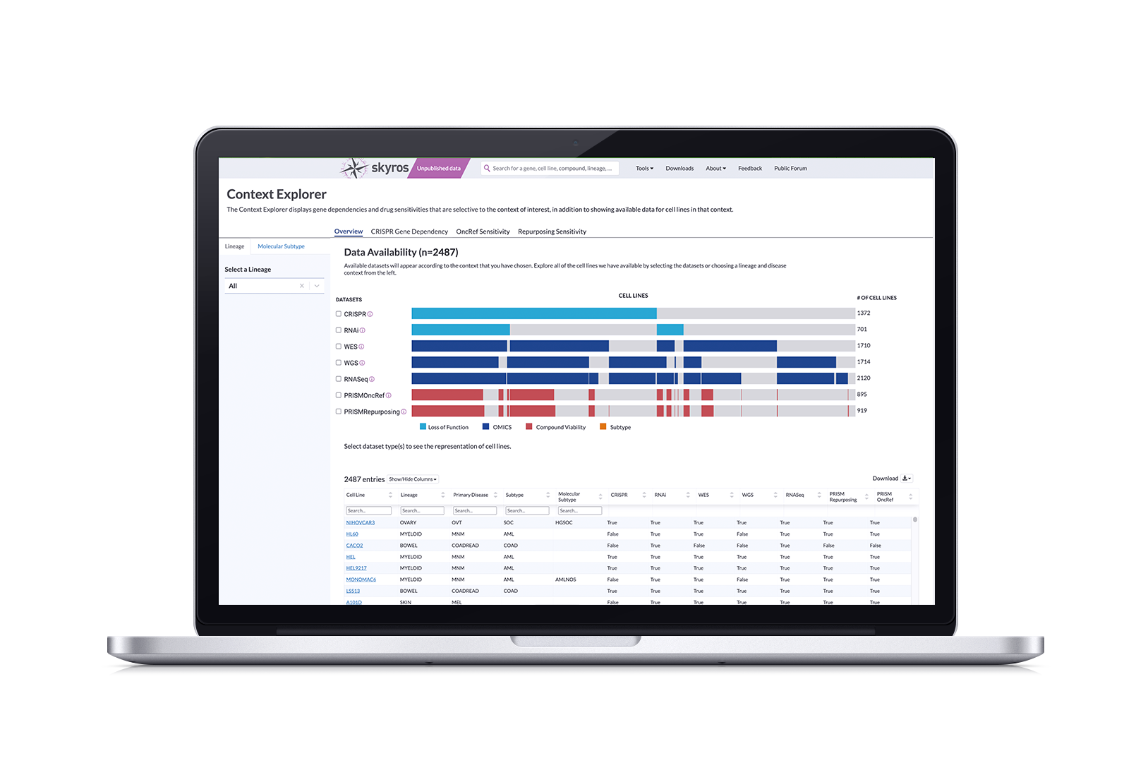
Solution: Context Explorer 1.0
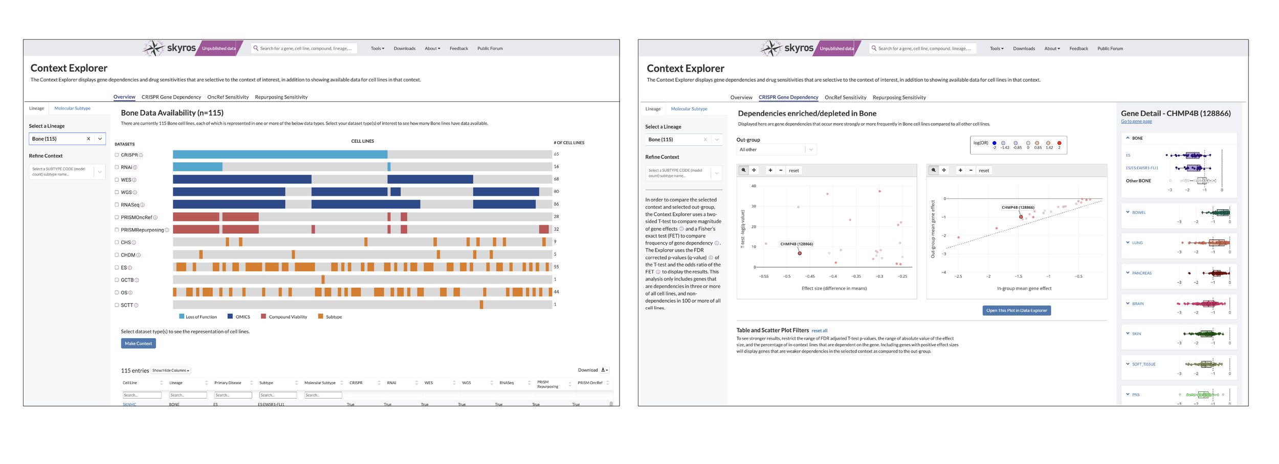
Context Explorer works by pulling from our existing datasets to visualize available data according to their chosen context. It has three main sections focusing on an overview of data, gene dependencies, and drug sensitivities. Its features allow users to:
See dataset distribution within screen types for the given context via a divided bar chart
Isolate screen types to determine overlapping cell lines in screens with checkboxes
Show more granular information and metadata for each individual cell line through a table
Offers scatter plots that allow scientists to select individual genes
Opens the opportunity to create a custom context after refining and identifying cell lines
Export plotted data to Data Explorer for further analysis
Strategy and Impact
DepMap has two main strategic goals that translate to increased user engagement:
Reducing confusion around using portal applications, measured through task completion rates
Greater connectivity between portal applications in the ecosystem, measured by imports of scrubbed data to Data Explorer
Increased user engagement directly affects how much funding the department receives; we need to prove that the tools and applications we are building do work and are being consistently used. In order to achieve this, it was imperative to create an intuitive application that reduced the time spent searching for lineage-specific cell lines and also functioned as a funnel to Data Explorer and other analysis applications.
DepMap releases software applications biannually. This project was started in Q1 of 2023, so we needed to ship a working application by Q323. In order to define an MVP that would be ready by Q3, we identified baseline functionalities that were necessary for users to identify datasets, curate their selections, and easily port over to Data Explorer and other applications.
Context Explorer has been live for a year and the feedback we’ve received is very positive. On average, it has reduced the time it takes to collect data by context by 50% (this is approximate and based on feedback collected through our forum and in-person symposia).
Funding for this project was renewed in 2024 and we are currently iterating on Version 2.0; our plan for future additions and updates are in the “User Feedback and Next Steps” section at the end of this case study.
Process
This was a collaborative effort between two computational biologists specializing in oncology and pediatric cancers, serving as subject matter experts (SMEs), along with a dedicated full-stack engineer, cancer data science leadership and the director of engineering as stakeholders, and myself as a the sole designer. I’ve visualized our interactions throughout this process through stacked bar charts (a nod to our final Overview design).
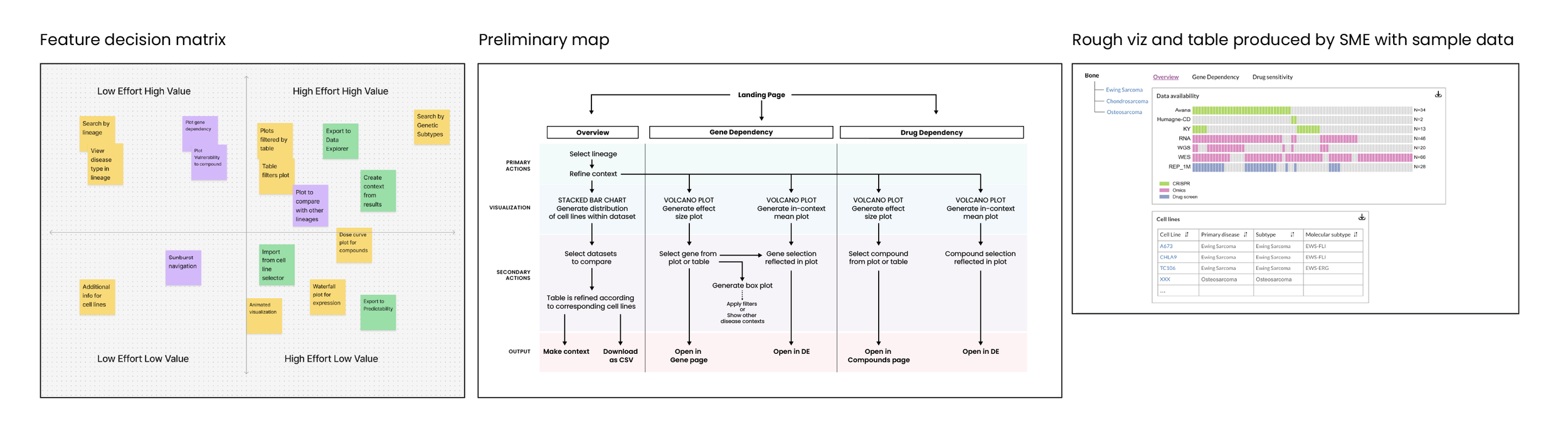
In the Discovery phase, our SMEs and I reviewed user requests from the forum and created “Value vs Effort” matrix. From there, we scoped requirements for this tool. I also consulted with the assigned engineer to better understand how the data is processed and imported.
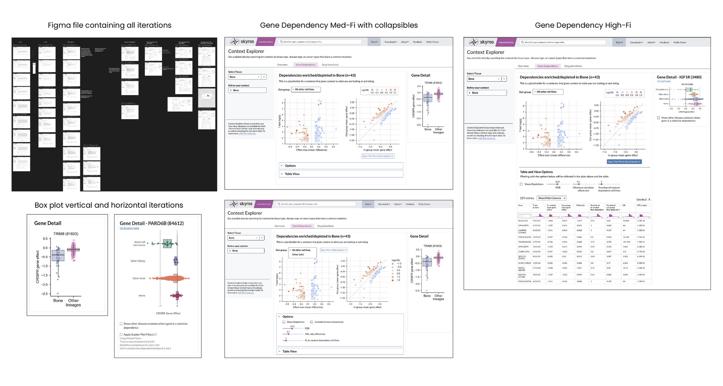
After conducting visual research and analysis of other data applications, I designed this tool to contain a searchable menu along with three tabs that allowed you to see an overview page, a gene dependency page showing expression plots, and a drug sensitivity page that had vulnerability plots. The goal was to avoid having to cross-reference by opening gene and compound pages. I met with my SMEs on a two-week sprint schedule to show progress and gather feedback.
I created a clickable prototype after the high-fidelity round, which we reviewed as a team. My engineer provided suggestions based on data import functionality and I adjusted the design before getting the final approval and handing off annotated documents. Once this application was built, my engineer and I had a brief mobbing session to adjust the CSS for minor tweaks that fixed hierarchy inconsistencies and alignments.
We presented the fully functional application to leadership and made sure it was accessible on our portal by adding links and content to draw attention. I then conducted a user study to run through the task of selecting and refining context-specific data. After reviewing our findings, we discussed what would be feasible to improve and offer for the 2.0 version.
Selecting a Lineage and Disease
To tackle selecting a disease lineage from a tissue, I mapped out a few flows on how to arrive at a subtype. Selecting your tissue activated a collapsible sub menu that organized primary disease types and could be expanded to show subtypes. I then created a low fidelity clickable prototype to show how this would work.
The example we used to build this out was Bone. Within the bone lineage, we had data for five different cancer types. At the time, only one had a subtype. So you could focus on Ewing Sarcoma as a whole, or further refine to select the EWS-FLI subtype.
Because this is a new tool, I decided to frame this as two steps: Select your lineage and then refine from that lineage. A common pain point is that our tools aren’t very intuitive, so breaking up actions into steps helps better guide our users towards their discoveries.
Which Visualization is best?
For the Overview page, we explored sunburst and bar charts. Sunburst visualizations are a standard way of visualizing data according to hierarchical organization; you see this a lot in data repository sites such as St.Jude’s PECAN. However, a use case emerged where scientists were interested in the overlap of data types (does my context contain CRISPR and RNAi screens? If so, how many?). This would be difficult to show within a sunburst. A divided bar chart can be leveraged to show both the amount of cell lines while aligning to show where datasets are available in different screen categories.
As I iterated on the design, I got a better understanding about how the data was imported and processed. The shading on these charts represented individual cell lines, but our engineer noted that it would take too much processing time to render each line individually along with a placeholder for absent lines. So we opted for solid groupings that had less granularity, but clearly showed the overlap.
We added checkboxes so you could select the datasets you wanted to compare. Unselected rows would dim by 50%, thus keeping the other information visible while making overlaps obvious. The colors helped identify datasets that showed loss of function (CRISPR, RNAi), omics (WGS, WES), and compounds (PRISM).
Design Iterations: Overview, Gene Dependency, and Drug Sensitivity Tabs
We went through six design iteration rounds. I created clickable prototypes in Figma to show interactive behavior, such as “what does the table show after selecting two chart rows?” Mitigating how the visualization and table behaved when there wasn’t enough data was one of the challenges that popped up. Another revolved around whether just naming the screens was enough; we crafted tool tips to provide minimally invasive information on the process for screening each set. During the third round, after checking with our engineer to make sure it was possible, we added a “make context” button that would export the selected datasets within the context to our Context Manager so that it could be used in other applications.
The gene detail panel originally featured a vertical box plot to compare effect and viability to a mean of other lineages. However, we wanted a more specified comparison, so, for example, instead of a plot comparing “bone” and “other lineages”, I designed a specified plot (Ewing Sarcoma) as compared to other bone, other solids, and heme. This would give a better idea if there were any dependencies (i.e. this gene expresses highly in Ewing Sarcoma and heme). DepMap, as a whole, is all about showing relationships between cancer genes, so this gives users an idea of whether it’s worth it to investigate the chosen gene or compound in other contexts.
User Feedback and Next Steps
Context Explorer went live in December 2023 (Q423). The feedback was very positive; our users found the visualizations helpful in selecting lineage-related datasets through the ability to easily see overlaps. Obviously, there were areas to improve:
Our users were only zooming into the context side of the volcano plot and deemed the control unnecessary, so we changed them to scatter plots focusing on the selected context in order to reduce noise.
Some reported that the Gene Dependency tab was broken because in certain cases, the plots remained empty. It was unclear that certain disease subtypes did not yet have enough data in order to compute gene dependency results, so we added identifiers, tooltips, and help text to clarify this.
We also removed the value range filters in the table as users found them confusing; they are often looking for extremes, so the sort arrows in the table headers were enough to help them find the correct values.
All in all, users were happy with the application, but wanted new features, such as the ability to browse by molecular subtype, data distribution by specific disease type, and refined compound information. The UI has been redesigned and we are currently in the development and testing process.