
Broad20
My Role
Design and Interaction Lead
Collaboration Partners
Director of Pattern
Mentees
Junior UX Designer
Junior Engineer
Stakeholders
Broad Director of Communications
Broad Executive Leadership
Timeline
4 months
Introduction
In 2004, the Broad Institute was founded with an ambitious goal: to leverage the newly sequenced human genome and fulfill the promise of genomic medicine. We celebrate 20 years of progress toward understanding the roots of disease and narrowing the gap between new biological insights and impact for human health.
One way of determining whether a research organization is successful is through the lens of scientific publications: "papers," the main channel through which scientists disclose and share new findings, developments, and discoveries. The amount papers an organization publishes spanning broad areas of research establishes a greater ethos and credibility, thereby increasing the amount of funding the institute receives.
(adapted from The Broad’s website and our Broad20 site)
Our Challenge: Create a visualization that narrates the scientific history of the Broad Institute
Our challenge was to find data and extract patterns and trends to show how Broad’s scientific efforts evolved over the past 20 years. It should revolve around the research done at Broad; we could choose to explore publications, topics, subject matter, or anything that could demonstrate growth and change. Our requirements were:
Create an interactive visualization leveraging our data of choosing
Craft an engaging story and provide contextual information on why specific areas are important to Broad’s mission of advancing science
Avoid unnecessary features that would give it the look and functionality of a tool, since this was framed as an editorial visualization
The format had to work as a digital e-poster for symposium presentation and a desktop application
Additionally, I had the challenge of mentoring two junior colleagues and guiding them towards executing my vision as the design lead.
Solution: Broad20 Publication Data Visualization Microsite
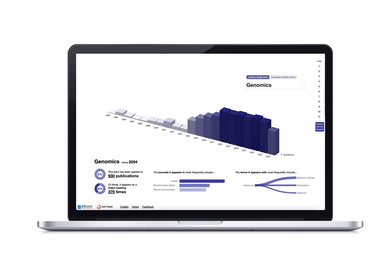
We created an interactive visualization microsite that told the story of Broad’s scientific growth through areas of scientific research and publication data. Through a guided, scrolly-telling format, our users navigate through 10 story points about important research subjects, such as Genetics, Computational Biology, Cancer, and COVID-19. Each story point has an animated visualization that filters according to subject and shows the total number of publications, as well as the terms associated with the research. This shows the scale and depth of the research over time. The side panel displays contextual information on each subject, and gives users the option to reveal links to published papers by the Broad associated with this subject.
The final visualization allows you to explore the complete dataset by searching an individual term or comparing multiple terms to trends in number of publications, or spikes in term usage, as well as overlaps of terms between subjects. For example, CRISPR-Cas Systems and Computational Biology had the highest number of associated publications in 2019. What was happening in the world of scientific discovery during that year that led to this correlation.
Process
Since this is an editorial project, the process behind it is different in that we are making decisions with limited user input and testing is mainly focused on finding bugs. This is a standalone site with a realized end point, making this process linear.
We wanted this to act like a story that you can interact with, so we chose a scrolly-telling format to help guide users through the narrative. Broad leadership selected 10 landmark scientific subjects to act as story points. We cleaned data from the National Library of Medicine's PubMed database in order to extract standardized Medical Subject Headings ("MeSH" terms) as well as year, frequency, and associated journals.
Visual Encodings and Design
Our visual inspiration came from a sample of DNA fragment base pairs viewed under electrophoresis. In the example we referenced, fragments that are larger in length have a darker and taller rectangle.
In our flat visualization, each row represents a MeSH keyword. The intensity of each bar reflects the number of times a keyword appeared in Broad-authored scientific papers published in a given year. The darker the bar, the more that keyword appeared in papers from Broad scientists.
Now that we had a our visual system and clean dataset to work with, our Director and Junior engineer coded a few variations to explore. These initial coded prototypes had the story text in a floating box that scrolled off the page once a new point was engaged. I was asked to help improve the design.
A three-dimensional view was discovered while we were all mobbing the code. While three-dimensional visualizations tend to be hard to navigate (don’t get me started on 3D pie charts), in an expository setting, this dimension can give a better idea of the number of times a term appeared through height.
Animations help condense data and alleviate legibility concerns
Since our dataset is HUGE, the entire viz would have to be incredibly small to fit on a screen, therefore rendering it illegible. Showing the entire viz as part of this reloading animation helps give users a sense of the scale without forcing them to squint in order to reveal subjects.
Each story point would trigger the reloading animation that produced a refined interactive visualization showing only corresponding data for the subject, along with a text panel that provided contextual information (definition and links to corresponding papers). I roughly storyboarded the animation by referencing static generated states of the visualization.
Guiding my mentees on the main visualization design
The most difficult part of all this was taking a step back from creating everything design-related and guiding the Junior UX Designer and Engineer on the design and layout for the main visualization. The easiest thing would be to design everything and give them a list of directions and tasks to complete.
But I was invested in helping them grow. I wanted the Junior Eng to strengthen their resourcefulness and the Junior UX to strengthen their confidence in articulating design decisions. And I wanted both to emerge as stronger problem solvers. We met biweekly to review prototypes and guide them to how to answer the questions they had. To build resourcefulness, I would answer questions with links to resources they could read and synthesize, or “what steps would you take to find the answer?” I asked why a lot. I conducted mock client presentation sessions to ease their nerves. And although it got a bit uncomfortable at times, I treated them with respect and empathy.
“Growth is not always comfortable or straightforward, and can be really frustrating. But that’s how you know that you’re putting in the work to improve,” I often told them.
So after six weeks of iterations, resources, 5 min analysis exercises, and “no question is a dumb question” sessions, they arrived at the final design, infographics layout, and the visualization control behaviors. And I improved my patience and trust in delegating work to others.
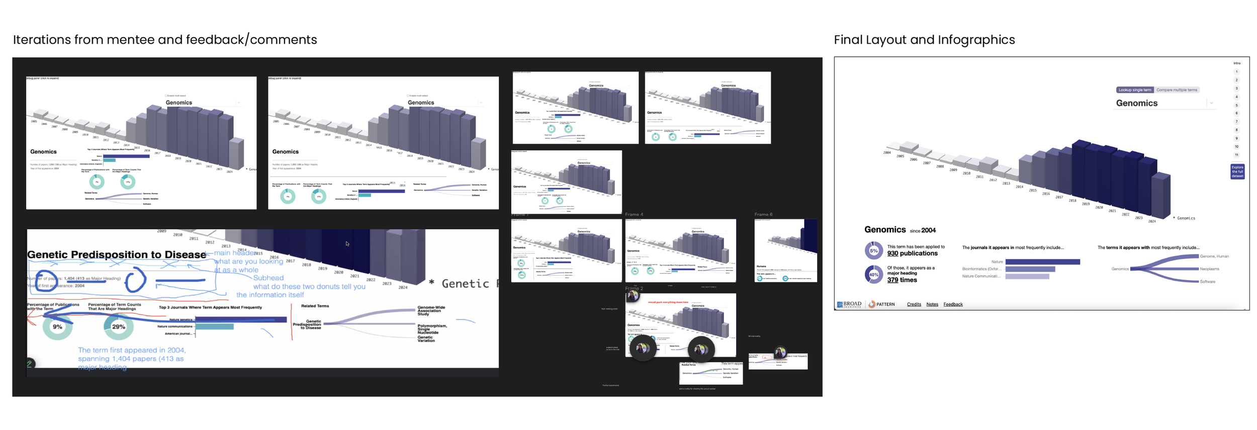
Refinement after testing
We tested the site internally by providing links to members from our Comms department and collecting their feedback. While overall positive, these two insights emerged:
Users wanted a direct link to the main visualization at the end; they didn’t want to scroll through the entire story each time they wanted to view and compare data.
Users wanted a way to sequentially navigate from one story point to another. These users were interested in a specific subject (such as Genomics or COVID) and didn’t care much for the rest.
Ultimately, we decided on adding Back and Next buttons to the main content, the ability to show and hide related publications, and a side menu that divided the site into story points with a direct link to the main visualization.
Launch and Reception
Broad20 was launched on 12/15/24. Reactions have been incredibly positive; the most comments were versions of “This is so cool!” and “Wow, I didn’t realize the scale and breadth of research at the Broad!” Given that this a linear process, we won’t be reassessing and iterating. If we were to reopen this project and create a 2.0, I would want to explore:
Improving the UI by anchoring the navigation buttons with a divider, redesigning the control panel, and updating the color palette to better incorporate the ochre
Implementing a funnel strategy and connecting this site to other bespoke, Broad-specific sites
The Pattern team will be using this project as an example in order to propose and structure future projects, and develop SOPs for generative visualizations and bespoke sites.