
Terra.bio
Introduction
Terra is a cloud-based scalable platform that enables researchers to access genomic data, run analysis tools, and collaborate with other researchers. It aims to liberate researchers from the restrictions that come with on-prem analysis by providing a platform that is modular, community-driven, open-source, and compliant with standards set by coalitions such as GA4GH.
Researchers create a workspace in Terra, which contains their data, notebook, analysis workflows, configs for their virtual machine, and storage. They can conduct massively scalable analyses and share their research with anyone, at any time. If their workspace has public permissions, unassociated researchers can clone it and duplicate the analysis.
Role
UX/UI Design
Collaboration Partners
Marketing
Customer Success
Senior Leadership
External Stakeholders
Microsoft
Verily
Problem
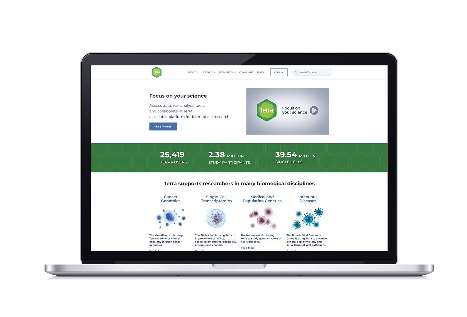
After its launch in 2019, Terra was scaling quickly but its outreach site, Terra.bio, was a simple 3-page information site that was built in Squarespace.
It was ineffective in helping prospective users understand how Terra could help them and why they should use it. Resources were scattered. The branding was inconsistent. And our Enterprise Team had to rely on a set of one-pagers to secure external partnerships.
The Broad was about to enter into a partnership with Microsoft and Verily; the announcement would drive traffic to our sites and we could risk losing potential users.
We needed to build an all-encompassing outreach site that would give a full picture of Terra's capabilities, showcase research, and easily point to resources that would help internal and external stakeholders.
Challenges
Content. How much is too much, or too little? How do we make sure that we fulfill these three target areas without going overboard?
Lack of resources. We did not have a designated team to develop or maintain this site and our internal developers were short on bandwidth.
Time. This site had to be defined, designed, and built in two months in order to coincide with the Broad-Microsoft-Verily partnership announcement.
Terra.bio’s main goal is to drive adoption and increase user engagement and retention.
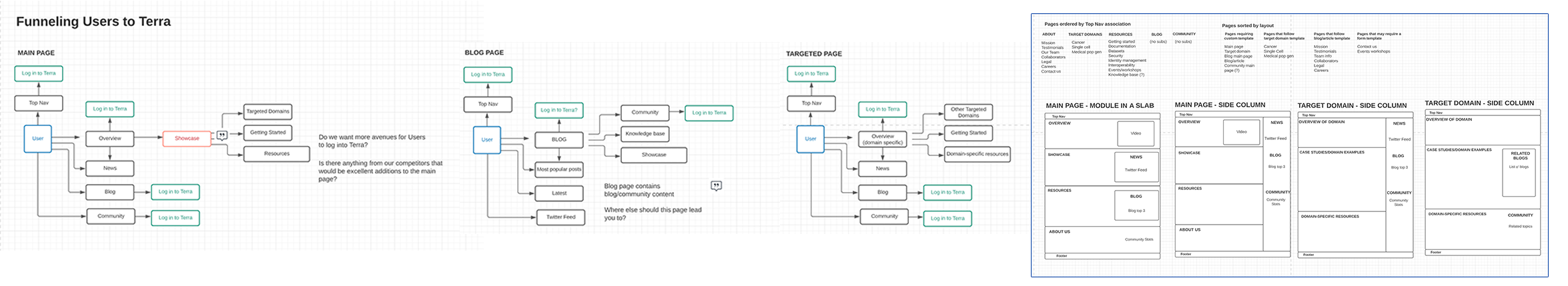
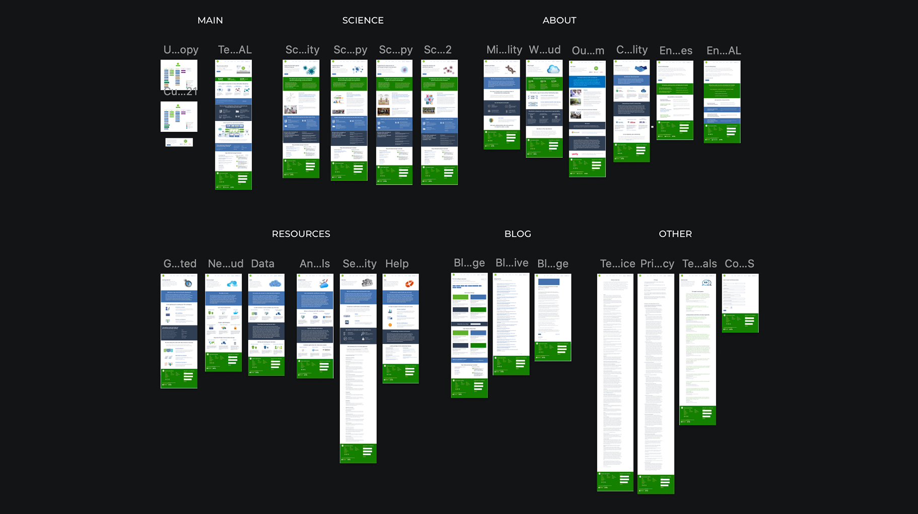
We defined 23 pages that would cover a holistic overview, targeted pages that contained links to active workspaces you could clone, resource pages that functioned as a mini-onboarding suite, enterprise information, and a blog hub.
Our target pages would spotlight four areas of scientific research that reflected the highest percentage of Terra users: Cancer Genomics, SingleCell Transcription, Medical and Population Genetics, and Infectious Diseases.
Process
We met three times a week during the initial 2-week discovery period in order to figure out the goals that the new Terra.bio should achieve, partnering with Marketing and Customer Success to leverage user data and competitive analysis to inform the content and site architecture. Building a funnel flow helped us identify places where we can sneak CTAs for signing up or logging into Terra.
During this time, we were also investigating development options. To mitigate resource deficiencies, the site would be built on Wordpress as a CMS, which would help us easily add pages, content, adjust code, and modify elements. We hired an external developer that specialized in Wordpress CMS.
Design
This site is a companion to app.terra.bio, but with a light-hearted yet intelligent feel. It follows the established Terra style guides and design system; the identity is based on succulents and uses the green hexagon as its visual anchor. Panels are color-coded according to what kind of information they contain. CTAs encouraging users to sign up or subscribe are strategically placed next to meaningful content. It contains a mixture of stock photos and graphics that I created.
Prototypes and User Testing
The next two weeks were spent iterating on prototypes. Wireframes and low-fidelity prototypes were discussed with all internal stakeholders to ensure that the information was effective and properly organized. We held light user testing sessions after we had a base set of pages on the development site. We had institute scientists freely explore, ask questions, and give us their thoughts.
One notable change that came about from this testing was increasing the weight and darkening the color on the blog page text font after users found them a bit hard to read.
Results
What went well: Iterations were fast, feedback was helpful, and content was generated at an alarming pace. It was an amazing team effort and we met our tight deadline because of it.
What went not so well: Our main limitation was the short amount of time to create this from start to finish; the final product was not as polished as it could have been.
However: Leveraging Terra.bio, along with social media and outreach events, has helped us grow our user base by 50% each year, from 600 monthly engaged users in 2020 to 1400 in 2022. And Frontline Support is enjoying a steady decline in onboarding help desk tickets.
Next Steps
We will be adding more pages to Terra.bio in the upcoming year, so we’ll set aside some time to redesign the blog archive, make improvements to the drop downs, revamp the icons, and lighten content areas to keep the visual design light and current.
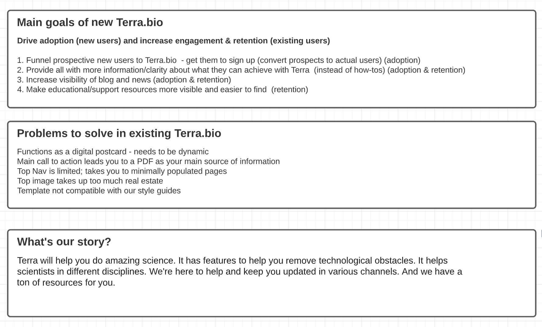
During the initial brainstorming session, we listed our goals, our perceived problems, and our story. This helped us focus on what needed to be accomplished without deviating into “nice to have” features.
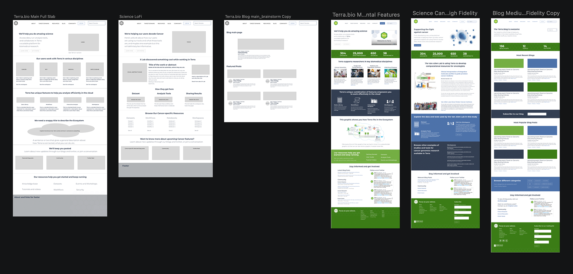
We also created funnel maps to show how our users would navigate the new Terra.bio and where they would find opportunities to log in or sign up for the Terra app. We came up with a list of pages and very rough preliminary mocks.
Low-fidelity mockups were created for rapid iteration of content and organization. Color and graphics were added in the medium to
high-fidelity phase after the content was finalized in order to limit distractions and maintain momentum.
The final 24-page design was delivered to our external developers via an annotated InVision prototype in accordance with their preferences. Here, you can see the consistency and deviations, which align with our branding guidelines.