
Data Structure Overhaul + Hub
Role
Evaluative Research, UX/UI Design
Collaboration Partners
1 Computational Biologist
2 Engineers
External Stakeholders
NIH
Introduction
The Cancer Data Science team produces terabytes of data, spanning approximately 1300 cell line models that represent the diversity of human cancers. The DepMap portal contains tools that allow scientists to analyze that data and export the results in order to fuel their research.
One tool is Data Explorer, which pulls directly from screened DepMap data and allows you explore relationships, such as dependencies between genes, correlations between compounds and genetic targets, mutations, and expressions through visualization plots. In late 2023, a new version of Data Explorer(2.0) was launched allowing users to have enhanced plot configuration, allowing them to plot genes, compounds, and gene pairs (the previous version only allowed models as plot points) which yields more granular results.
The Problem
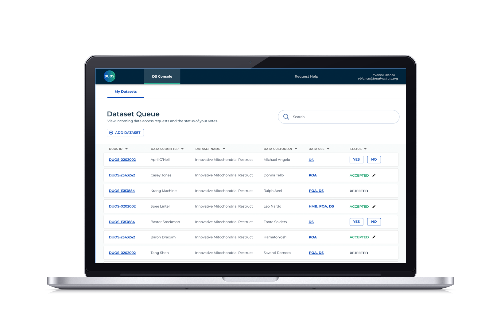
After Data Explorer 2.0 (DE2) was launched, we conducted a user study with a subset of power users who are computational biologists. We asked these scientists to walk us through how they conduct their research with DE2 and we noticed that every scientist had difficulty selecting the correct dataset for their generative analysis.
The main confusion stemmed from having to scroll through a dropdown menu that contained 69 named datasets, some having similar names. In order to know whether the dataset contained the correct data, you had to look up each dataset through a separate download page and clicking “download”; only then would a modal with information about the dataset pop up.
We had two goals:
Restructure our data by organizing them into categories so that there are fewer options to choose from
Design a way to provide all the necessary information without having to leave the application
Image
Our scientists are interested in browsing datasets according to lineage and disease context. They requested that we build a visualization application that allowed them to answer these questions:
What data is available for my disease type of interest?
Given this disease type, are there any gene dependencies that show up more often in this disease?
Are there any drug sensitivities associated with these genes?
How strong are these dependencies and sensitivities?
At the time, DepMap only presented a single page for each disease context and lineage (for example, Ewing Sarcoma, which is associated with bone tissue), which contained two large tables. The first listed all of the cell lines associated with the lineage, but in order to find out if specific data was available, you had to visit the specific cell page. The second listed all drug sensitivity and CRISPR dependency enrichments, which also led to individual
DE2: Organizing the Data
We started by looking at a spreadsheet of the 69 datasets available for use in Data Explorer to figure out how to group them into subsets. Sorting by Data Type would reduce the menu to 13 options; while Feature type had 15 with a few that “depends on the column”. We’re trying to ease confusion, so we went with Data Type as the first level of sorting.
We mapped this out and designated a default dataset per data type.
However, because we now have specific features as points (i.e. genes or compounds, etc), there are data types that only work for specific features. In some cases, such as choosing a Compound as your points, where the only corresponding data type is Drug Screen. In these cases, your default option is the only option, so it is locked in. This prevents you from accidentally choosing an incorrect dataset.
The next step was to design a way to view the information about the dataset and enable our users to select a different one if the default did not contain the data they needed.
DE2: Details about your Dataset
We simplified the menu of options and designated defaults. But how can you be sure this is the quintessentially correct dataset?
Sneaking in more information in an already loaded interface is tricky, but not impossible. Using dataset information from our Data page, I mocked up several variations in order to decide whether we wanted static information in a popup or tool tip, or an interactive modal that allowed you to browse other options and potentially choose a different dataset.
In the interest of containing everything and limiting the amount of steps a user has to take, we built an interactive modal that gives a summary of the dataset, the option to download, and a side menu for adjusting parameters and choosing a different version.
Image
Our scientists are interested in browsing datasets according to lineage and disease context. They requested that we build a visualization application that allowed them to answer these questions:
What data is available for my disease type of interest?
Given this disease type, are there any gene dependencies that show up more often in this disease?
Are there any drug sensitivities associated with these genes?
How strong are these dependencies and sensitivities?
At the time, DepMap only presented a single page for each disease context and lineage (for example, Ewing Sarcoma, which is associated with bone tissue), which contained two large tables. The first listed all of the cell lines associated with the lineage, but in order to find out if specific data was available, you had to visit the specific cell page. The second listed all drug sensitivity and CRISPR dependency enrichments, which also led to individual detail pages.
This was a messy experience a lot of page-hopping and abandoned research. Our goal was to create a visualization application that
Image
Sunburst vs Divided bar chart for the Overview Page
A sunburst is a standard way of visualizing data according to hierarchical organization. It appears frequently on browsable data portals.
However, a use case emerged where scientists were interested in the overlap of data types (does my context contain CRISPR and RNAi screens? If so, how many?). This would be difficult to show within a sunburst.
A divided bar chart can be leveraged to show both the amount of cell lines while aligning to show where datasets are available in different screen categories.
Volcano Plot vs Scatter plot for Gene and Drug Sensitivity Pages
Side Quest: Create the Data Hub
With all this restructuring, our Data pages no longer made sense as they followed the same conventions.
The Data Downloads page listed datasets by name; each selection had two corresponding tables in sections defining primary and supplemental files. A second page, Custom Downloads, presented files by data type in a vertical list.
This suite had similar and additional problems:
Datasets were organized by name, in a dropdown, so you’d have to scroll through hundreds of names (while DE2 contained 69, this was the complete repository)
The table for primary files was too long, so users missed that there was another section for supplemental files
Information for the datasets was only available after clicking the download icon
Apparently, this was so confusing that users ended up downloading the entire file set from Custom Downloads, only to end up deleting files they didn’t need after waiting an hour for the download
Let’s Apply Sorting Logic to Design
We quickly interviewed 10 super users to find out what information (name, description, date, size?) about datasets would they need in order to confidently select a dataset.
For the current release page, we grouped files according to data type and used these types in a horizontal tab menu that quickly allows you to view smaller sets of files according to type. This is a design pattern I created for our Cell Line page. I also suggested more descriptive language beneath the header so that it is clear that the section contains both primary and secondary files in case the primary section gets too long.
I explored and presented medium fidelity mocks on how to best present datasets (cards? tables?). While a card would attractively present information about each dataset, there were too many, which would have our users unnecessarily scrolling. I landed on a collapsible table design, which would take up less real estate while providing the baseline information a user needed.
When closed, each row provides the name, an abridged description, and two actions: download and copy URL (for citations). When opened, it provides a detailed description, column IDs, sources, and citation information. Since the overview row remained constant, users could perform actions without closing or navigating else where.
Here’s an unexpected challenge that arose after reviewing with my engineers: While we updated the way release datasets are submitted, allowing to flag by data type, the majority of the entire data catalogue did not contain these categories, so sorting them by data type and using the tab menu would only work for 20% of all entries. Our compromise was to keep dataset information in collapsible rows, but provide filters for our users have more targeted options to choose from.
Note: I’ve only focused on the data organization aspect of the Data Hub, since it was inspired by the work we did on DE2. The creation of this hub was an entire process on its own in order to give our users everything they’d need to know about our data and would add about 20 sections to this case study. As with every digital case study, I’m always happy to provide more information about the overall process for the Hub and its visualizations through a presentation.
Image
Our scientists are interested in browsing datasets according to lineage and disease context. They requested that we build a visualization application that allowed them to answer these questions:
What data is available for my disease type of interest?
Given this disease type, are there any gene dependencies that show up more often in this disease?
Are there any drug sensitivities associated with these genes?
How strong are these dependencies and sensitivities?
At the time, DepMap only presented a single page for each disease context and lineage (for example, Ewing Sarcoma, which is associated with bone tissue), which contained two large tables. The first listed all of the cell lines associated with the lineage, but in order to find out if specific data was available, you had to visit the specific cell page. The second listed all drug sensitivity and CRISPR dependency enrichments, which also led to individual detail pages.
This was a messy experience a lot of page-hopping and abandoned research. Our goal was to create a visualization application that
Image
Sunburst vs Divided bar chart for the Overview Page
A sunburst is a standard way of visualizing data according to hierarchical organization. It appears frequently on browsable data portals.
However, a use case emerged where scientists were interested in the overlap of data types (does my context contain CRISPR and RNAi screens? If so, how many?). This would be difficult to show within a sunburst.
A divided bar chart can be leveraged to show both the amount of cell lines while aligning to show where datasets are available in different screen categories.
Volcano Plot vs Scatter plot for Gene and Drug Sensitivity Pages
Results and Next Steps
We continue to refine Data Explorer. We conducted a post-deployment user session with the initial super users.
Since deployment in June 2024, we have seen a 20% increase in data downloads from our Current Release and All Data pages, as well as a drop in entire dataset collections downloaded from the Custom Data page. The Custom Data page design remained unchanged, and this was mostly to see if users were still resorting to using that page instead of the others. This would inform any future redesigns